Most viewed logos – Page 141
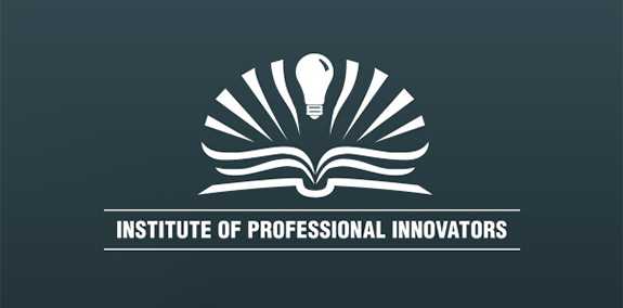
The Institute of Professional Innovators logo features a light bulb emerging from the pages of an open book to convey the concepts of bright ideas and constant study.


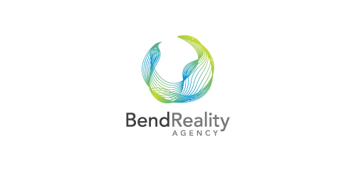
Bend Reality Agency is an event company. They organize concerts and provide stage lighting at the highest level.
Designer: Alek Chmura
Logo for freedom in art.

Black Friday Go get your bargains 50% for branding ;) https://www.behance.net/duminda
Logo process and branding: https://www.behance.net/gallery/31767063/Peaceful-Bay-Logo-Branding A wine company requested a logo that would represent Peaceful Bay a region located in a South -West Australia. Doing some research, I found out that whales visit the southern Ocean, a great symbol for the label and name. After multiple sketches this is the final result.

Logo for a project University Project.

Logo for Copper Basin Art Exhibition. Combination of an eye and a brush on a canvas.

famous bernese dj in switzerland


https://www.behance.net/gallery/34442955/Spiritual-Wisdom-Americas «Spiritual Wisdom Americas nace en la Montaña Sagrada del Ausangate, Perú, en Julio 2011, en un viaje de búsqueda de visión, donde en cada paso hay un diálogo directo con la Sabiduría de la montaña y sus Guardianes»

logo energetic

itagma
A simple Indian bird logo design

I made this ligature a little time ago, but know I create some kind of logo with this stuff.

"O Rei do Cangasushi" logo is a prototype for a probable sushi bar in Brazilian northeast. The artistic design was entirely based on the figure of "Virgulino Lampião", the legendary king of the outlaw (outlaw means "cangaço" in portuguese), folk hero. A slice of salmon above the rice cake represents the typical hat of outlaws (outlaws means "cangaceiros" in portuguese) led by "Virgulino Lampião" (who wore glasses and had a blind right eye) at that time and today is considered the symbol of the Brazilian northeast.
The logo design has clean and creative approach that leaves remarkable appeal.
The Zenith Facility Services logo creates motion with slanted type and a "Z" that morphs into overlapping shapes. Its blue and white brand colors add a cool, professional tone to balance the design's energy.

"We seek to refer the "S" in a caravel, indicating demand for the ideal property for each client.”

Concept identity for non-existent company. I made it just for fun. One day I came up with the idea of this logo, so I decided to make it. Hope you like it.

Company programmers. Logo combines the first letters of the name, A and S.

Pizza
Squirlo Logo concepts

The arrow portrays Avanse as a tool that breaks through barriers through education.
