LogoMoose Logo Inspiration
  • Logo
    Galleries
    • Featured logos
    • Most rated logos
    • Most viewed logos
  • Identity
    Galleries
    • Featured identities
  • Packaging
    Galleries
    • Featured Packaging
  • Designers
  • Upload
  • Become Member
  • Login

Mindfulness – Here & Now Present Moment Awareness

  Mindfulness – Here & Now Present Moment Awareness  

Mindfulness – Here & Now Present Moment Awareness
Facebook
fb-share-icon
Pinterest
Reddit
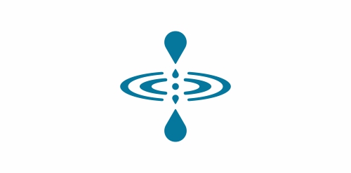
  • A symbol for an idea of mindfulness (being here and now/present moment awareness). So firstly, this symbol is presented like a physical representation of present moment - http://en.wikipedia.org/wiki/File:World_line.svg Vertical forms represent time - past and future. Horizontal forms represent space - 360 degrees. And the one is always in the center - being here and now. Secondly, you can see a symbol of a water drop. This is the most often used metaphor to represent the idea of mindfulness - image.google.com search for "mindfulness". Only this water drop symbol is presented in a kind of mirrored way. But don’t think about it, because as mentioned above, this is time - past and future, both are illusions, stay centered in the present. “Empty your mind, be formless. Shapeless, like water. If you put water into a cup, it becomes the cup. You put water into a bottle and it becomes the bottle. You put it in a teapot it becomes the teapot. Now, water can flow or it can crash. Be water my friend.” --Bruce Lee More info here - http://www.radicalcourse.com/here-and-now-symbol-present-moment-awareness/Mindfulness - Here & Now Present Moment Awareness Designer: radicalcourse
  • Submitted: 05/02/2012  •   Featured: 05/02/2012
  • Stats: This logo design has 10878 views and is 0 times added to someone's favorites. It has 5 votes with an average of 3.80 out of 5.
  • awareness
  • being
  • buddhism
  • here and now
  • meditation
  • mindfulness
  • present moment
  • radicalcourse
  • water drop

  Designer  

radicalcourse

View portfolio

  More logo design  

Kelebek

Beauty company. Kelebek means butterfly in turkish.

anamaria-moreiraComments0May-28-13
Three Nuts General Contractors

This logo is for a completely fictitious entity named Three Nuts General Contractors.

The idea for this brand came to me when I was out and about in the world, and saw a contractor's work van drive by. As I looked at the number 3 in the telephone number on the van, I started thinking about how a cleverly constructed 3 could reveal a wrench in negative space.

Using a hexagonal bolt nut as my main source of inspiration, I thought of a whimsical name which would support the concept I had in mind. In this hypothetical situation, the "Three Nuts" could be a team of three general contractors.

The icon is built from the angles of the bolt nut, and the entire mark should evoke a heavy industrial feel; something that could be stamped into metal, etched into wood, or simply affixed on the side of a work van.

Click here to see the case study for this logo, which chronicles its development, and includes full design rationale, sketches, electronic roughs, and alternate designs.

atomicvibeComments0Sep-18-11
fishmail

guestComments0Jun-20-09
Imperial

yoonComments0Oct-27-10

  About  

Logo Inspiration showcases logos, identities and packaging
We are an inspiration and design community that was founded in 2008.
Here, we showcase logos, brand identities and packaging designs created by professional designers, design studios and agencies. We showcase the best work from the best designers from
Join us and upload your work! Register here!

© 2008 - 2026 LogoMoose.com - All logos are property of their respective owners.
FAQ - Privacy Policy - Imprint