Most viewed logos – Page 139

"Vsya Posuda" means "All utensil" - on-line shop.


Monogram YMW

Catering and Events company

Shop of the equipment for divers.

This is a design I did for a horse racing club in Canada.


Body aesthetic studio. Talia(rus) = waist

A laundry located in Hurghada, Egypt

Best for SMS related firms. I made a stylish and cool looking panda.

Flowers delivery..
WIP. More on Behance: https://www.behance.net/gallery/18393779/-Logo-for-a-brewery-producer
Brand name : Atlas Appraisal Group Field: Appraisal real estate Year : 2013 Location : US Branding Agency: Bratus Scope of works: Art direction, Logo, Stationary, Brand guideline
IMLAY is the stage name of a South Korean Electronic Music Producer. Genre : Future Bass , Trendy EDM Music. https://soundcloud.com/imlay

Natural handmade soaps and cosmetics
Logo design for a Dutch sport physiotherapy company called 'fysiosportief'. They asked me to come up with a new refreshing logo for their business. The client preferred the type to be custom and as friendly looking, easy to read and a little twist integrated in it that shows some sort of speed and dynamic. The icon is a combination with the letter 'F' together with a running human. Also tried to perfect the balance by adding that same shadow effect from the typo.

Voyeur concept

Coffee Shop style Japan

Online Cloud Services
Logo for beer shops
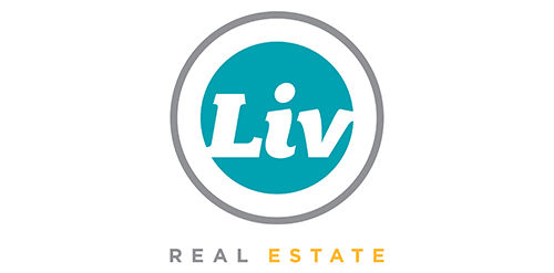
Urban Jungle was hired to develop Liv’s brand strategy, including its tagline and brand story. After clarifying its vision and defining its mission, values, personality, promise, experience, Urban Jungle then crafted the new corporate identity for the firm. The new look is simple, bold, and contemporary. It captures the essence of the firm’s fun and friendly personality while communicating its promise to help Edmontonians love where they live.

PIMP Agency Communication
