
Alek • Triptic.pl
Hello folks,
all info about me and my company you can find on www.triptic.pl
- - -
 Joined July 2009
 107 logos
 http://www.triptic.pl/

Mobile Convert is a young team specializing in creation of audio and video content distribution systems on the Internet, develop technical content, mobile applications, games, websites and content management systems. - - - - Logotype has a simple, readable form resulting from the simplification of the M letter and incorporated in it a universal symbol of "Play" clearly referring to the audio-visual character of the company. - - - Live on www.mobileconvert.pl - - Full ID here http://on.be.net/1HbaOBD - Follow us on www.fb.me/triptic.design


Unused idea for insurance company.

London based financial/capital company - approved version.
Playing with name & letters.
Typo illustration which i have been made in free time.
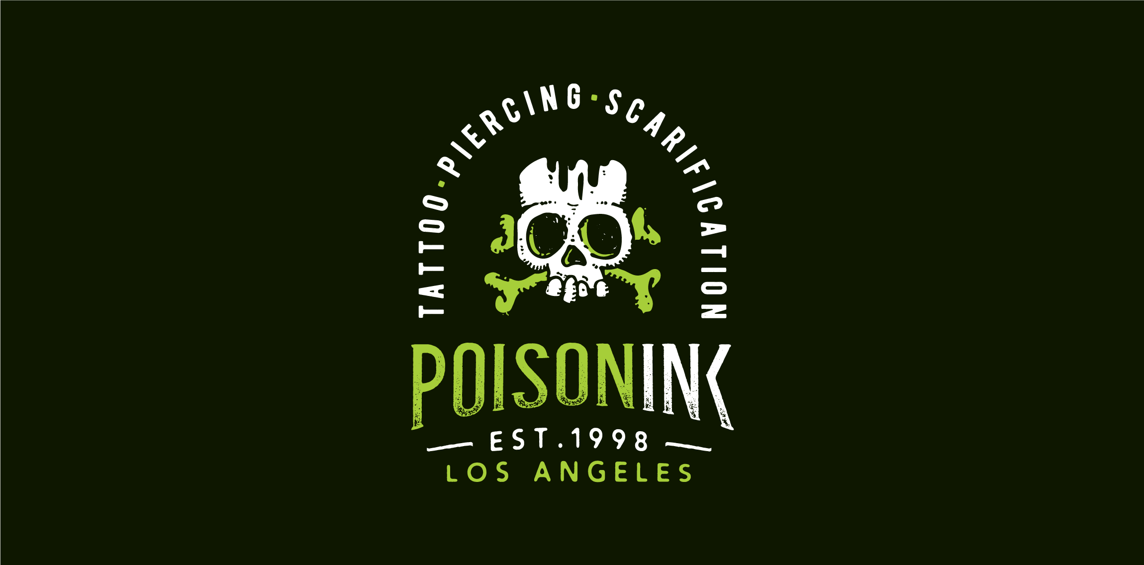
Playing around the naming, drawing & typography: Poisoning + Ink = POISONINK Dabum tsssssss!
Logotype for social media mobile app.

Wordmark crafted for developer of interactive solutions. • • • Follow us on www.instagram.com/triptic.pl
Just playing around the naming and custom letters. Follow us on www.instagram.com/triptic.pl

W + crown = Winner Sport/fitness/lifestyle online magazine. • • • Facebook • Instagram

Logotype created for online platform offers bitcoin exchange services. • • • Follow us on www.instagram.com/triptic.pl

Logotype created for Polish studio specializing in artistic wood processing. The mark refers to two "T" letters, metal nails & hammer chisel. "Tartak" name mean sawmill. • • • follow us on www.instagram.com/triptic.pl

Unused idea for luxury watches manufacturer. • • • follow us on www.instagram.com/triptic.pl
Logotype created for company manufacturing specialized adapters for photo & movie cameras. The logo is a combination of "C" letter and "7" in negative space. • • • Created for Motyf Studio • • • follow us on www.instagram.com/triptic.pl
A hipster emblem designed for small company offers healthy meals with delivered to your workplace. "Przepis" means "recipe". • • • Made for Motyf Studio • • • follow us on www.instagram.com/triptic.pl
Just playing with letters :) • • • follow us on www.instagram.com/triptic.pl
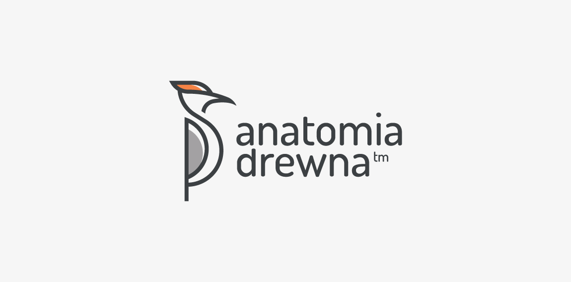
A mark created for company dedicated to woodworking wooden furniture, houses, toys, gadgets etc. Woodpecker perfectly fit as a symbol of handcraft of woodworking. Anatomia drewna mean "wood anatomy". • • • follow us on www.instagram.com/triptic.pl
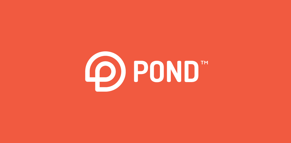
Logo design made for new dating site/app. Mark is a combination of "P" letter with simplified shape of water lily (very characteristic part of pond). • • • follow us on www.instagram.com/triptic.pl
Custom letters made for australian company specializing in UPS systems. - - - follow us on www.instagram.com/triptic.pl
Logotype created for China based web & mobile apps developer. - - - follow us on www.instagram.com/triptic.pl
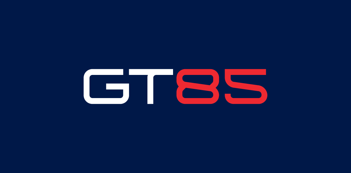
GT85 is a company providing innovative and comprehensive technology solutions for the industry. General concept was to create a transparent, industrial and technological identity. Unrealized project. • • • Full view and description on https://www.behance.net/gallery/29066969/GT85 • • • Follow us on www.instagram.com/triptic.pl
Mark for company manufacturer high quality specialized paints and varnishes. • • • Follow us on www.instagram.com/triptic.pl
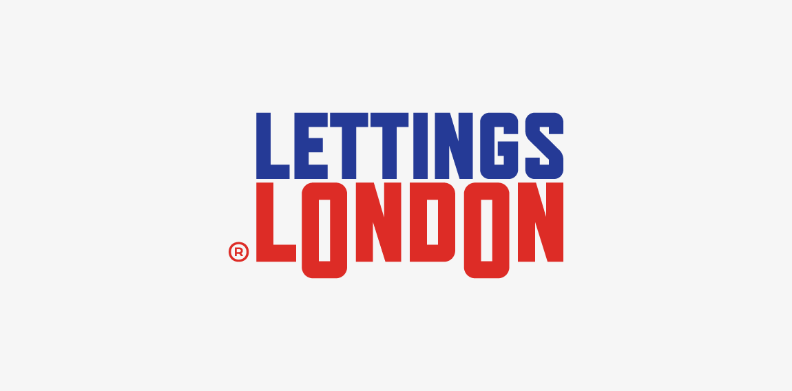
One of concepts for London based flat rental online service • • • Most important thing was to use british color palette and avoid typical elements as houses, doors etc. • • • Follow us on www.instagram.com/triptic.pl

Logotype made for devamjewelry.com - manufacturer of unique & luxury jewelry adorned with diamonds and gemstones. • • • Made for Twindots (UK) • • • Follow us on www.instagram.com/triptic.pl