GLAD-HEAD
 Joined January 2011
 23 logos
 http://www.logomoose.com/members/GLAD-HEAD/
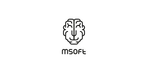
MSoft - this is a young team it-specialists. The name stands for MindSoft. Based on this, we have created a logo transformer schematic showing the brain. Sign acquires different characters thanks to those who entered into it. A myriad of options that allows you to personalize each carrier branding, while fully preserving the recognizability.
The company is engaged in the work of Land Management - topografichno-geodetic, mapping, research, work on the surveying of lands, the administrative division of lands, etc.
Logo for the event - bowling tournament a steady advertisers. logo for this year's event (2012). We decided to abandon the standard picture of balls and have fun logo, because the play will be creative people.
More information about the project last year:
http://gladhead.com/#837331/Advertising-Bowling-Cup
company is engaged in marketing of aroma - aromatization of various premises, activities, points of sale
logo for the event - bowling tournament ы steady advertisers. We decided to abandon the standard picture of balls and have fun logo, because the play will be creative people.
The annual agricultural fair. The event is held in Kharkiv, so guess the logo symbol of the city - Mirror stream.
Photo of the symbol of the city: http://tourist.kharkov.ua/fotos/town/str.jpg
Company that is specialized on breeding chickens and shipment of chicken meat and eggs with planned expansion to chicken half-stuff production. The design idea is to differ various type of the production by using different colors for the underlying 'egg' on the logo. E.g. pink - for chicken legs, green - for fillet etc.
Our logo inspiration gallery will give you the creative boost you're looking for. Get your daily dose of logo design inspiration to work on your own logo design projects and get your business going. Be amazed by our logo designers and their brand guidelines. We are here to help you impress your clients and our fellow designers. Professionalize your logo design skills and get yourself to a new level. Browse our logo design gallery and discover all the new logo design trends and much more. We know you love logos!
