
urbanjungle
 Joined January 2013
 13 logos
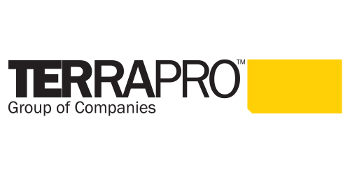
Urban Jungle took a graphical approach to Terrapro‘s identity, drawing from the colour and shape of their flagship product—the synthetic rig mat. The cropped corner of the rig mat’s design, was integrated through all aspects of Terrapro’s design system, including their letterhead and business cards and website.


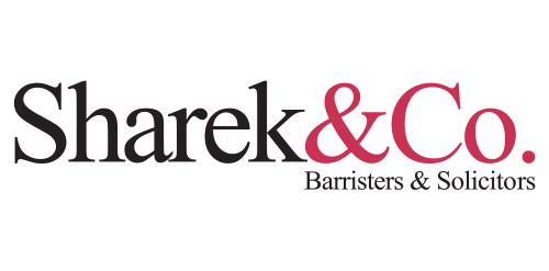
Urban Jungle developed a simple and stylish corporate identity that was initiated by distilling the firm’s name to simply Sharek&Co. From there, the wordmark and colour palate were created. The updated identity is contemporary yet classic, professional yet relaxed, it’s personable and balanced—just like the firm and its staff.


Urban Jungle developed a corporate identity system inspired by the Venn diagram that defined their customer experience. The design system is clean and crisp, which helps to position the firm as stable and intelligent while maintaining the allure of their quiet confidence and professionalism.
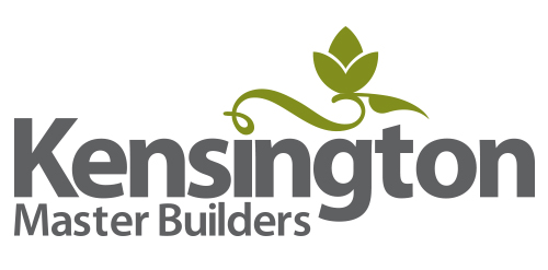
Before the launch of its new, semi-custom home line, sustainable home builder, Kensington Master Builders approached Urban Jungle to create its brand identity and design system. Urban Jungle created an elegant, contemporary marque and complete identity program, including logo, stationary, specification packages, promotional items, and signage, as well as a website integrating the concept for their new home line.

Urban Jungle designed the Burkinshaw Law Group corporate identity. The subdued identity was inspired by Olde England and grounded upon the firm’s core values of wisdom, service, and goodwill. It incorporates a completely customized font treatment based off the Clarendon typeface.
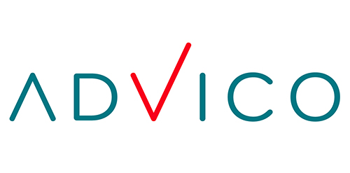
Urban Jungle was given the mandate to put in place a complete corporate identity program for financial planning firm, Advico Professional Investment Services. This wordmark incorporates a customized font treatment to the the Bryant Pro typeface.

Inspired by Super Heroes and Greek Legend, Urban Jungle designed the Guardian identity. Integrating the “G” of the product’s name into a Captain American-esque shield, and using a charcoal colour treatment on a bold stylized version of the Gotham typeface, the identity blends a vivid colour palette of pink and purple, giving the identity strength and modernity.
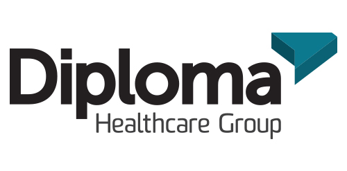
Inspired by the ancient Japanese art of folding paper, the negative space from an origami-styled “D” creates Diploma’s icon. Using a deep charcoal colour treatment on a bold stylized version of the Museo Sans typeface, the identity combines vivid aqua and chartreuse colours, designed to strengthen the company’s fortified position as “the definitive partner for medical device sales in specialized healthcare markets.”
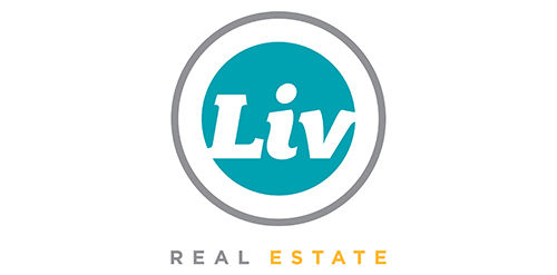
Urban Jungle was hired to develop Liv’s brand strategy, including its tagline and brand story. After clarifying its vision and defining its mission, values, personality, promise, experience, Urban Jungle then crafted the new corporate identity for the firm. The new look is simple, bold, and contemporary. It captures the essence of the firm’s fun and friendly personality while communicating its promise to help Edmontonians love where they live.
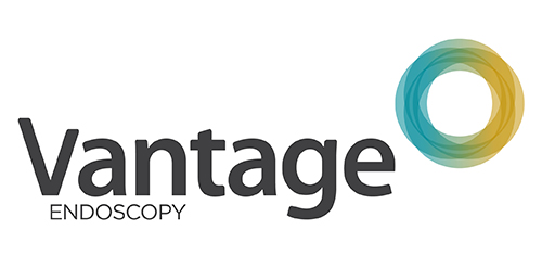
Inspired by the Spirograph, Urban Jungle designed the identity using a combination of four semi-transparent aqua and ochre circles. The circles symbolize the convergence of two unique corporate entities into one new corporate brand identity — Vantage. Using charcoal for the typeface, the identity blends a vibrant colour palette giving it a fresh, smart and energetic feel, and reflects the youthful and contemporary edge of the company.