Highest rated logos
Highest rated logos – Page 341

TRINOX is fresh modern dynamic brand with short easy memorable name. It will suite well to any business or industry.


depper bow

sold Logo for real estate

Handmade handbags, clutches, and wallets

A logo for a real estate agency. Abstract and modern design was required.

MAIN

Human resources company.
Half-symbolic, half-typographic concept. I have started with a concept of a road leading ahead, with a guiding star above, showing the way. Then, I had to add top serifs to get the letter "T", and with a little stretch of imagination it could be interpreted (or rather the negative space it creates) as the night-sky`s sphere.
I am pretty happy with the shape I have ended up with. It is purely geometric, simple, elegant, unique and strong. Of course it is also the initial of the company name, and the hidden message can be viewed as added value.
keywords: "T", professional, trustworthy, solid, experienced, elegant, simple, guidance
Logo for film festival.
Logo ideal for a security company or something similar.
Original logo for printing or writing. For sale.

OWIO is fresh modern dynamic brand with short easy memorable name. It will suite well to any business or industry.

Gallotti Umbrellas, italian umbrella company corporate identity and logo design

Metal sheet factory from Romania.
The logo is created for a private luxury resort in Phuket. The main concept of this resort is "best kept secret", hence, the use of a very light neutral colour and braille letter as an logo mark.


MJ Hughes Construction is a premier Pacific Northwest heavy civil contractor
with strong capabilities in earthwork, utilities and structures

Logo design for power grid company.
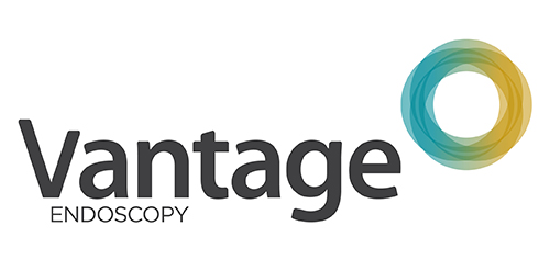
Inspired by the Spirograph, Urban Jungle designed the identity using a combination of four semi-transparent aqua and ochre circles. The circles symbolize the convergence of two unique corporate entities into one new corporate brand identity — Vantage. Using charcoal for the typeface, the identity blends a vibrant colour palette giving it a fresh, smart and energetic feel, and reflects the youthful and contemporary edge of the company.
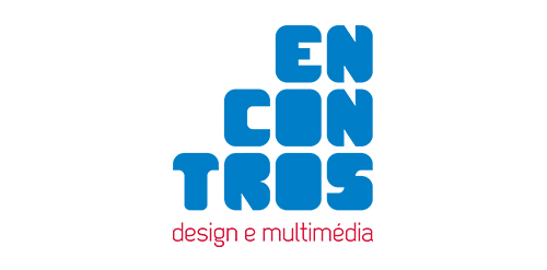
[see more in behance @ http://bit.ly/W8GJLS] Encontros Design e Multimédia is an event. It has being taken place since 2009 and consists in a week dedicated to promote and develop design and multimedia activities, workshops and meetings in the city of Braga. It's promoted by Escola Profissional de Braga. The design, organisation and communication of the event is the responsibility of a finalist student. [The brief] Encontros Design e Multimédia had a clear ambition, grow year after year, it wanted to inspire, involve and thrill the students, professionals and enthusiasts about Design and Multimedia. The logo was to be used in the website, facebook, promotional material, including posters, flyers, video, and a lot more. The goal couldn't be clearer, it had to be unusual. [The solution] The logo represents Encontros's strong ambition. It has all the elements to succeed, it's simple, relevant, it incorporates tradition, it's distinct, memorable, versatile and it stands out from the crowd. It's designed to be filled. Filled with photos, images, participants, speakers, filled with design and multimedia. It has no icons of design or multimedia and doesn't need them, it has all the qualities of both and all the creativity to be anything. [Typography] Encontros has a unique typeface, its custom and it's designed specifically for this brand. It's a bold geometric typeface designed to be filled and to get noticed in every contexts. [Colors] The colors are one of the most important elements of Encontros. The chromatic scheme is very expressive, it's a variation of the well known CMYK, providing a vast number of combinations making the brand very dynamic and inspiring as well. [see more in behance @ http://bit.ly/W8GJLS] [joserodrigues @ http://be.net/joserodrigues]

http://wp.me/s4571j-altegro