Highest rated logos
Highest rated logos – Page 344


Professional logo for a water and plumbing company. The icon has a tap with a water drip. The pipe also forms a P. This adds a clever touch to the logo design. The blue, black and white colors make the logo look very vibrant. The font has a pipe like feel which adds to the concept of the logo design.

“Seixe” is a Portuguese word that comes from the Arab culture and describes a type of rock, very typical on certain rivers in the Portuguese Costa Vicentina e Sudoeste Alentejano natural park. SEIXE brand’s symbol represents the strong idea from the rock and, also, the existing connections between the local culture and all other areas, symbolised by the connection among the SEIXE last three letters (i – x – e).
Logo Spoon De Luxe

Sullivan Restaurant Group is a restaurant consulting and management firm in Denver, CO

Travel Pillow Review is a website dedicated to reviewing the best travel pillows available to help people make informed buying decisions. The logo was designed using Gotham Rounded. http://www.travelpillowreview.com/

Sports and lifestyle dedicated portal in London, Totallysportsinlondon comes in a 60-page bimonthly magazine, a website and travel offers to the British capital. Brand Brothers was given the visual identity, print and web art direction of the the brand and started a graphic so british and dandy.

Logo made in 2104 for the US Embassy event in Bogotá, Colombia for the promotion of pure american cocktails.

House Rawyal is a house music events promoter from Malta.


Logo was created for Slovak yoyo nationals in 2014.

Logo for a building company
www.mikemark.com Personal logo

Logo for company dedicated to trophies


Proposal for Logo of an architecture agency.

This is a logo for a Peruvian company that lets you use a land line so you can call anyone in Perú.
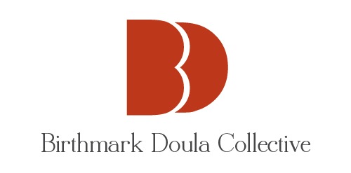
This was a design that occurred to me while I was working for Birthmark Doulas on another project.
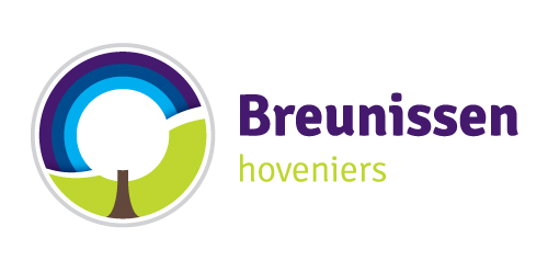
Breunissen gardeners is a gardener in the Netherlands. In this logo is (in the negative space) a pruned tree and hedge visible, a specialty of the gardener.

Logo for company trading roof fasteners

EZPR - pr agent logo design
