Highest rated logos
Highest rated logos – Page 343

Palio is an advertising agency powered to ignite brands in bold and beautifully disruptive ways.


Logo for property investment company - specialising in holiday homes and rentals.
The Anagenix corporate identity was inspired by phyllotaxis which is an arrangement of crisscrossing spirals found in nature. The visual of this concept and everything Anagenix stands for has an interesting parallel of how they combine science with nature through innovation and discovery. The circles contained in the shape symbolise their brand values – the many partnerships, the scientific discipline, their expertise and trustworthiness. The colour palette was inspired by its NZ origins and nature. Looking at the world through this scientific lens of the phyllotaxis this identity has been designed to behave like a chameleon by taking on the form of the medium it is put on. It may applied with varying images from the NZ landscape and the natural products that may be in the pipeline. It may also be diecut to suggest the explorative nature of their business.

Logo for racing team

logo for S.V.V.

Fireworks company
Logo created for a new startup company.
Logo for a small scooter and motorcycle shop.

sea food logo

A logo design for account management program

Second try logo. It's an iPhone app logo wich I'm currently working on.

Just colorful logo idea.
Fashion Design
Balkan Hard - Techno Community

"Brand with typography designed for a law firm that works with realistic idea but to show the seriousness neoclassical added serifs to her.”
bird

Project created for a company which works in the sphere of warehousing ISO- containers. http://logomachine.net/

KM monogram, personal mark

Building Engineering

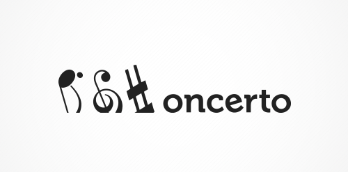
The concept is: subtraction. The name was created by leaving off the first letter of "concerto". So doing the same in the visuals was an obvious choice.