

Encontros Design e Multimédia
Encontros Design e Multimédia


- [see more in behance @ http://bit.ly/W8GJLS]
Encontros Design e Multimédia is an event. It has being taken place since 2009 and consists in a week dedicated to promote and develop design and multimedia activities, workshops and meetings in the city of Braga. It's promoted by Escola Profissional de Braga. The design, organisation and communication of the event is the responsibility of a finalist student.
[The brief]
Encontros Design e Multimédia had a clear ambition, grow year after year, it wanted to inspire, involve and thrill the students, professionals and enthusiasts about Design and Multimedia. The logo was to be used in the website, facebook, promotional material, including posters, flyers, video, and a lot more. The goal couldn't be clearer, it had to be unusual.
[The solution]
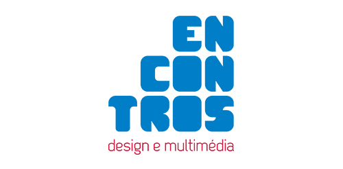
The logo represents Encontros's strong ambition. It has all the elements to succeed, it's simple, relevant, it incorporates tradition, it's distinct, memorable, versatile and it stands out from the crowd. It's designed to be filled. Filled with photos, images, participants, speakers, filled with design and multimedia. It has no icons of design or multimedia and doesn't need them, it has all the qualities of both and all the creativity to be anything.
[Typography]
Encontros has a unique typeface, its custom and it's designed specifically for this brand. It's a bold geometric typeface designed to be filled and to get noticed in every contexts.
[Colors]
The colors are one of the most important elements of Encontros. The chromatic scheme is very expressive, it's a variation of the well known CMYK, providing a vast number of combinations making the brand very dynamic and inspiring as well.
[see more in behance @ http://bit.ly/W8GJLS]
[joserodrigues @ http://be.net/joserodrigues]
 Designer: joserodrigues
- Submitted: 03/07/2013 • Featured: 04/03/2013
- Stats: This logo design has 4701 views and is 0 times added to someone's favorites. It has 3 votes with an average of 3.00 out of 5.
Designer


