
Alek • Triptic.pl
Hello folks,
all info about me and my company you can find on www.triptic.pl
- - -
 Joined July 2009
 107 logos
 http://www.triptic.pl/

An older naming and logo design made for e-commerce with stuff like contact lenses, glasses, sunglasses etc. - - - Live on www.lentica.pl


Logo design for company which organizing intergration trips. "Pan Przygoda" in english means "Mr. Adventure". - - - Made for Motyf.pl

Logo design made for Toronto based company producing fully customizable cardboard packaging. - - - Live on www.boxcaptain.com

Logotype made for little printhouse from UK. The heart refers to the passion with which they indulge in their work; folded element ambiguosly refers to paper.

"CSR w wielkim formacie" in english mean "CSR in large format". It is a Corporate Social Responsibility program started by Opinion company (large printhouse). - - - An elephant is a symbol of big/large (format), intelligent/wisdom (responsibility) in multicolor squares form as a symbol of print. - - - As seen on www.csropinion.pl

webdesign from Poland

pet store www.emusklep.pl

"Synerga"is a company operates on renewable energy market which is currently one of the most lucrative and safe investment fields in Poland. In its offer gives an opportunity to invest in wind farms built by themselves and share in the profits earned by them. Our task was to prepare a comprehensive visual identity through which the company will become the image of a professional and reliable partner in the investment on a large scale and to strengthen its position in the market.

social media company.
IT Consulting Company located in Washington D.C. specializing in Virtualization, Network Design and Cyber Security

Tapcanvas - site used to create mobile applications without knowledge of the programming process. Triptic created some interesting logos, from which our client selected the most accurate. Co-operation was a success - the final effect is a combination of mobile interface, paint splats and pixels which resulting in is funny, interesting, and refers to all free and easy modifications which can be made by the user. Full ID http://bit.ly/RhywhK
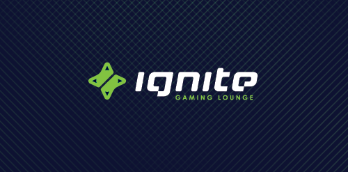
ignite is a Chicago located place where you can hang out playing in your favorite video games, enjoying a good coffee, beer, make new friendships or just having a good time with old good pals. Main objective was to obtain a mark which in clear and simple way communicate the nature of the place which represents + design custom typography to show an uniqueness of this place. We decided that the best solution would be a combination of two game controllers (symbol of game community) in the shape of the d-pad which also refers to the form of sparks, which is a direct reference to the IGNITE name. Full ID http://bit.ly/XkAZ43

dating site. logo is a combine of "B" letter, heart shape and "L" letter in negative space.
"yeah" like an ambigram.

R.S.B.C mean "Robert Smolarek Business Consulting" - unfortunately client changed name for "Fog City" and choose other design - you can check it here www.fogcity.com.pl

logo for conditioner product
Logo for little pension in Poland mountains. ROZA comes from the first name of owner RÓŻA which mean in english ROSE. Custom typography.
music label

wayside inn. the mark is a combination of road shape and the "H" letter in negative space

Logo for e-sport team from New Zealand.