
Most viewed logos · Page 74
"yeah" like an ambigram.


http://s6.ifotos.pl/img/elevator-_ensxsep.png
Developed for a series of self-enrichment events entitled "Choose Love," this logotype was created to be instantly recognizable, whimsical, and inspirational. By stacking the eventʼs name and carefully editing key letterforms to maintain legibility, a heart appears to connect the words ‘choose’ and ‘love,’ bringing emphasis to the eventʼs mission.
The Choose Love experience combines a variety of creative exploration sessions, guided meditation, and yoga to help participants gain personal insight. The visual campaign included the development of the Choose Love brandmark, promotional poster, and event branded buttons distributed to participants.
© Keith Kitz, All rights reserved.


REVISION
A logo for a travel agency.

Furie Lublin - womens american football team

..

Surfboard company!
Epsilon logo by Boldflower design Studio
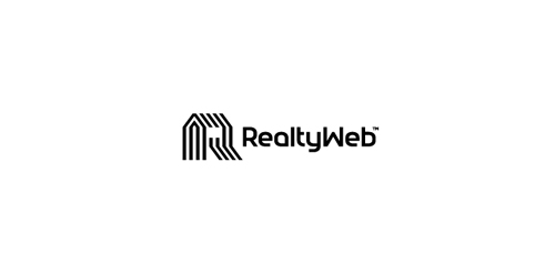
Approved logodesign for Realtyweb.com Custom made Typography. RealtyWeb.com combines 3rd party data and information on close to 30,000 state and local real estate markets to help the consumer and the real estate professional make educated decisions.

Client work

Company logo. Zeebrands slogan is "the long-lasting brands" and to express this in logo mark we used the old style of drawing in caves and chosen to draw a turtle as one of the long-living creature on the earth.

A Work in progress logo for a Content Management System that helps teachers/schools. 'Schola' (Latin for School) + Organize = Scholarize. The symbol is a combination of an owl (represents wisdom) and a pencil (represents education)

From a Collection of Ready Made Logos by Ingus Eisaks.

TANAP is national park in Slovakia and I just wanted to do a logo in this style.
Writer - Identidade

Unused logo proposal for Hart&Hound

lightning + quotation marks
