Most viewed logos – Page 36

Organization of holidays (Cartoons)


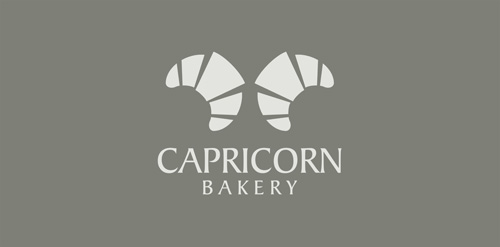
Logo for bakery. Two croissants as hornes.

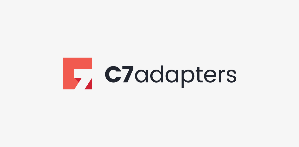
Logotype created for company manufacturing specialized adapters for photo & movie cameras. The logo is a combination of "C" letter and "7" in negative space. • • • Created for Motyf Studio • • • follow us on www.instagram.com/triptic.pl

unused logo proposal for flash film media

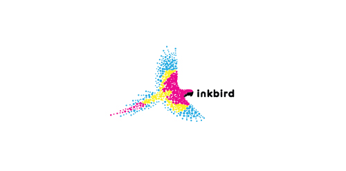
A bird made up of the colors cyan, magenta, yellow, and black to represent a printing company.

Rasa ( Essence) Drop In an abstract B Form.

Logo created within the LEEROY agency for a free stock photos site

preschool

FREYA is fresh modern dynamic brand with short easy memorable name. It will suite well to any business or industry.

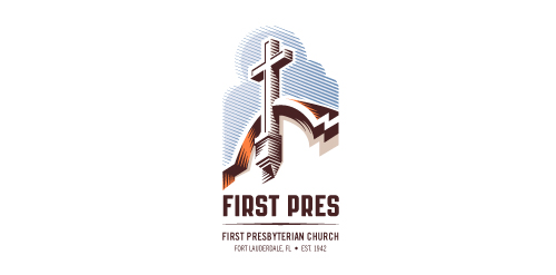
Redesign of the church's old logo in a stylized, illustrative manner, making it more welcoming, contemporary, friendly, casual, & upbeat. Client specified a rendering of the church’s architectural arch and cross in the perspective in this photo, and required an emphasis on the church's nickname, “First Pres."
Here, crisp, exacting vectors emphasize the architectural soundness of the church — a metaphor for the concept of faith as the solid foundation in one's life. This design makes use of hatching to add gradient dimensionality, enabling it to easily reduce down to 1-color. Colors are indicative of the building itself, including terracotta roof. Check my Flickr case study or Dribbble for more images, detail, and full design rationale.

Logo design for independent consulting firm


Q-Bird
"Ferona" (fertility clinic)- logo.

Corporate identity for dealing with Video Filming https://www.behance.net/gallery/32694765/Branding-Mush-production

Polish software house strongly devoted to Research & Development in cutting-edge telecommunication solutions.
Logo design for Red Ink Tattoo Studio.

Marine cafe. Network of catering.

Logo for a marketing company. In the symbol, you can notice initial "w" of wise, crown (chess figure) and movement/moves, that makes strategic/strategy plan which also makes the letter w.

Football Club

Logo for a potential higher end housing development in a nice secluded wooded area. Many deer live in the area.