First Presbyterian Church of Fort Lauderdale
First Presbyterian Church of Fort Lauderdale

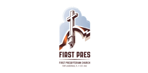
- Redesign of the church's old logo in a stylized, illustrative manner, making it more welcoming, contemporary, friendly, casual, & upbeat. Client specified a rendering of the church’s architectural arch and cross in the perspective in this photo, and required an emphasis on the church's nickname, “First Pres."
Here, crisp, exacting vectors emphasize the architectural soundness of the church — a metaphor for the concept of faith as the solid foundation in one's life. This design makes use of hatching to add gradient dimensionality, enabling it to easily reduce down to 1-color. Colors are indicative of the building itself, including terracotta roof. Check my Flickr case study or Dribbble for more images, detail, and full design rationale. Designer:
 - Submitted: 01/18/2012 • Featured: 02/16/2012
- Stats: This logo design has 17538 views and is 0 times added to someone's favorites. It has 13 votes with an average of 4.00 out of 5.
Designer
atomicvibe
More logo design
Unused idea for luxury watches manufacturer. • • • follow us on www.instagram.com/triptic.pl
This classically designed logo retains the history or this sporting organisation but gives it a completely modern brand.


