Most viewed logos – Page 332
Designer: Denis Aristov Client: Caspian Flat Glass Industry: Production of Flat Glass Keywords: Caspian, flat, glass, production, c, f, g, initials, raster, dots, transparency, blue


This logo came to my mind for a marine fauna conservation group; the whale ventral pleats are also a hand that represents protection and care.


WORKNESH is fresh modern dynamic brand with short easy memorable name. It will suite well to any business or industry.
Because is not a cow, get it?

Publishing House Logo
The Background Burner quickly removes the background from any image or photo.

Logo for great quality yemeni honey
Welfare Trust Logo

Row Houses
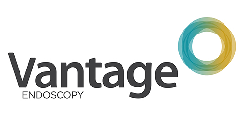
Inspired by the Spirograph, Urban Jungle designed the identity using a combination of four semi-transparent aqua and ochre circles. The circles symbolize the convergence of two unique corporate entities into one new corporate brand identity — Vantage. Using charcoal for the typeface, the identity blends a vibrant colour palette giving it a fresh, smart and energetic feel, and reflects the youthful and contemporary edge of the company.
Did this for a submission - Its for a donation drive. The curves/flourishment around the words represented hands - which means extending our hand to help the needy people with a sincere heart and of course with a smile too. Within the logo there is a heart and a smile see if you guys can spot it! Any comments on how to improve is also welcome! Appreciated it!.
Logo design for MAGNAMAQ a heavy machinery company.

logo for a new social network site

Fire Resistance Solutions: the combination of flame, shield and drop of water in one sign. --- Designer: Piotr Ploch

Logo design for SeeSaw Optometrist. The main identity of the brand and hidden meaning is a eye diagram - 'How the human eyes sees, How light travels into eye' and letter A to complete a logo and represents the brand See and Saw.

Fiskelaw

This is our proposal of Shamakhi City Branding.


Lion Gazelle Brand by designdough

For hair styling saloon..S and P initials as scissors.

A brand new logo for new company from Netherland