LogoMoose Logo Inspiration
  • Logo
    Galleries
    • Featured logos
    • Most rated logos
    • Most viewed logos
  • Identity
    Galleries
    • Featured identities
  • Packaging
    Galleries
    • Featured Packaging
  • Designers
  • Upload
  • Become Member
  • Login

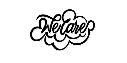
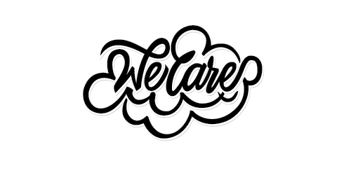
WeCare

  WeCare  

WeCare
Facebook
fb-share-icon
Pinterest
Reddit
  • Did this for a submission - Its for a donation drive. The curves/flourishment around the words represented hands - which means extending our hand to help the needy people with a sincere heart and of course with a smile too. Within the logo there is a heart and a smile see if you guys can spot it! Any comments on how to improve is also welcome! Appreciated it!.WeCare Designer: ahjoboy
  • Submitted: 12/30/2014  •   Featured: 02/03/2015
  • Stats: This logo design has 5095 views and is 0 times added to someone's favorites. It has 3 votes with an average of 2.00 out of 5.
  • ahjoboy
  • Brush
  • flourishment
  • hand
  • lettering
  • type
  • typography

  Designer  

ahjoboy

View portfolio

  More logo design  

KEVMOR

florisdesignComments3Jul-27-09
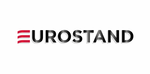
EUROSTAND

Logo designed for portable exhibition stands. Main idea of this logo is, that basic shape is 2D plane and you can create 3D stand from this 2D plane, that's why the letters are from 2D shapes to 3D.

mipolakComments0May-02-11
Defense.10

Unused logo design proposal I did in 2013. For Sale!

vasilenevComments0Jun-25-17
Dip

A concept. A visual play on words.

onegeekarmyComments0Sep-05-14

  About  

Logo Inspiration showcases logos, identities and packaging
We are an inspiration and design community that was founded in 2008.
Here, we showcase logos, brand identities and packaging designs created by professional designers, design studios and agencies. We showcase the best work from the best designers from
Join us and upload your work! Register here!

© 2008 - 2026 LogoMoose.com - All logos are property of their respective owners.
FAQ - Privacy Policy - Imprint