
Shihab
 Joined March 2011
 21 logos
 http://www.logomoose.com/members/Shihab/
Logo designed for a Mens Formal Wear Brand


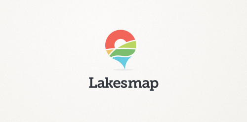
Logo designed for an app about Lake District (England).. The app is about getting info on tourists spots in the place.. The place is known for its natural landscape
(Logo idea: river, hills, sunset in a map pointer) :)
Hope you like it!
Logo for a Product Packaging Company..
For a iPhone app development company
Network of Scientists.. Logo is the concept of a Thinker formed by a connective line..
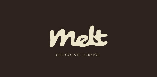
Brand: A Chocolate Lounge
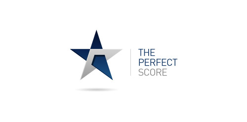
The Perfect Score : A credit repairing company.
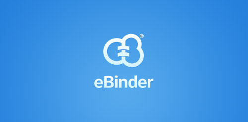
eBinder is a brand which is into cloud computing and decreasing the amount of paper in accountant companies by electronic archiving. So i thought to have the brand name (E and B) into the logo with their business concept in it..
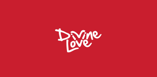
A concept given for lovers community..
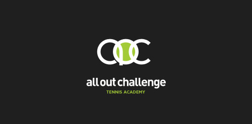
AllOut Challenge is Tennis academy
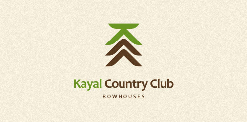
Row Houses
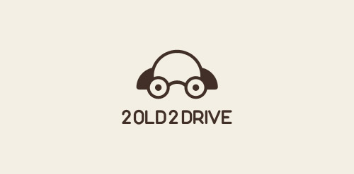
Brand story: Driving classes for old drivers!
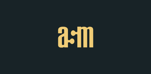
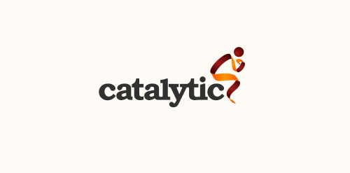
Brand: Advanced Scientific Matching..
A conceptual thought.
A conceptual thought.. Waiting for the client :)
My own logo
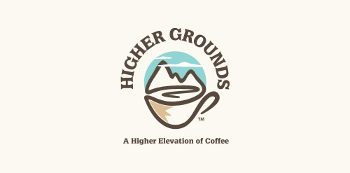
'Higher Grounds' is coffee shop in Cloudcroft (New Mexico) situated 9000ft above the sea level with cool hills.. It's a kinda tourist spot.. So that's where this logo came from.. My idea is to show the place (Cloudcroft) with mountains and to take it over the coffee in a single line drawing.. And few colors added to make it more scenic by having the business on the core of the logo.. so it's kinda 50% for the business and 50% for the place..
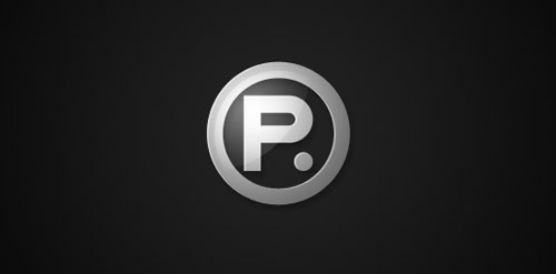
A simple thought to represent 'perfect' by a simple dot which can represent completion, perfect and this is it kind...
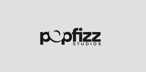
PopFizz Studios.. Thought to show the 'O' popping out..
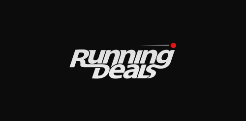
Running Deals.. Thought to show the running in the form of letters..

cSquare is a upcoming coffee shop brand in India..
My idea here is to have a typeface played logo which holds a complete meaning to the brand.. I made the 'c' and 's' in a form of coffee cup and represent the 'c' and the 'square' which the brand name... So while it goes standalone it doesn't lose it's meaning..
Our logo inspiration gallery will give you the creative boost you're looking for. Get your daily dose of logo design inspiration to work on your own logo design projects and get your business going. Be amazed by our logo designers and their brand guidelines. We are here to help you impress your clients and our fellow designers. Professionalize your logo design skills and get yourself to a new level. Browse our logo design gallery and discover all the new logo design trends and much more. We know you love logos!