

Most viewed logos · Page 232

 0Dec-28-08


Some experiment about verbicon, i hope you like :)
 0Dec-04-16
Oxus Aviation is a company that specialises in the brokering of deals between airlines and sourcing of planes and engines for their clients. They wanted a logo that would represent them, without falling into the bracket of ‘obvious airline company’. I opted to go down the route of utilising the wings of an aircraft in an abstract way. By having one arrow facing ‘North’ and one facing ‘South’ the connection to the brokering service provided by Oxus is apparent in the ‘trading’ nature of the symbol. It also offers a nice reference to the global nature of the business and that any direction is possible. It was made clear by Oxus that they wanted to use a dark blue as the main colour for the logo, I complemented this with a mid grey of clouds to give a real feel for the sky.
 0Nov-24-16
Logo PROJECT FLOW
 1Dec-20-17
A mark for a sports supplement supplier called 'Stackz.' The concept was to create the letter 'S' from stacked elements.
 0Jul-10-15
 0Aug-06-09
Logo for jewelry manufacturers.
 0May-15-16
Some experiment about verbicon, i hope you like :)
0Mar-08-17 1Dec-29-08
Access Internet Service logo
 0Feb-07-10
My own logo.
 2Jul-02-14
Logo for custom furniture company.
 0Apr-14-16
Incorporated my initials (Daniel Janev) starting "d" from the top, looping to the "j" actually the same form in the end. Little bit in retro grunge style.
 1Mar-22-11
 0Dec-06-10
Coworking
 0Jul-15-14
medical center
 2Oct-06-11
Logo Design for Antonella Muscat Photography, 2010.
 0Jan-02-11
logo for a social welfare association based in mexico.
 0Jun-29-16
The brand name was inspired by its NZ origins, the Maori language and it pure make-up, hence the pura part of the name.
We developed a vibrant mark and bold visual language to share the unique (and exciting) story of Apura. The images evoke the purity of this product and the colour palette was picked from the NZ landscape.
 0Mar-01-13
 1May-28-09
New York Fish logo, was designed for any company, dealing with fish selling, or any other kind of fish food. You can see the "crown" of statue of Liberty city in NY, and illustrated fish - New York Fish.
 5Jun-12-12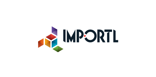
This is a logo for a completely fictitious entity named IMPORTL, which could be an open source web development site, or some type of developer software.
The idea is that the triangular facets form a series of open holes, or "portals," in multidimensional space. The central facets can also be seen to form a cube which is open on three sides. Lying before each opening is another opening on that side's respective "floor," yet, in an Escher-like paradox, where spatial orientation is an irrelevant construct, there is no floor. There is no up, down, left, right, back, or forth. This hyperspatial environment suggests infinite possibilities for the arrangement, manipulation, and exchange of data.
For color, the idea is that the primary colors that form the central cube beget the secondary colors that rotate outward, suggesting expansion, transformation, evolution.
The mark employs a custom typeface that compliments the angularity of the mark.
Click here to see the case study for this logo, which chronicles its development, and includes full design rationale, sketches, electronic roughs, and alternate designs.
 0Nov-11-13
Nextime is a clubbing / electronic music portal.
 4Sep-05-11
Concepts design for a School Newspaper reporting website.
 0Aug-29-16