

Most viewed logos · Page 231

Logo for the cosmetic company.

 0Mar-20-17


Logo for a consulting company. The idea behind the logo is: kangaroo jumps - level up, kangaroo has a pouch - savings.
 0Aug-27-13
Freeloader Inc. is a New Delhi, India based design agency and this modest logo was designed keeping in mind the name and its nature of business. Hopefully, you all like it :)
 0Sep-15-13
 0Jan-23-09
Suit&Tie – wedding video, Poland
 0Feb-07-14
unused logo for foliage company
 1May-09-11
 0Dec-06-10
New logo concept for the barley & rye malt based drink »im nu«. See the process behind the custom type here: http://dl.dropbox.com/u/14259079/im_nu_process.png Big view including »Chocolate
 1Jul-26-11
Logo for the Polish School in Hague (Stichting Poolse School Den Haag). Stork is the symbol of the city. He is wearing mortarboard. National accents are flags on sides of the sign.
 0Jul-20-17
Just colorful logo idea.
 0Apr-14-11
Haunt Jaunt 5k Halloween event logo
 0Dec-12-16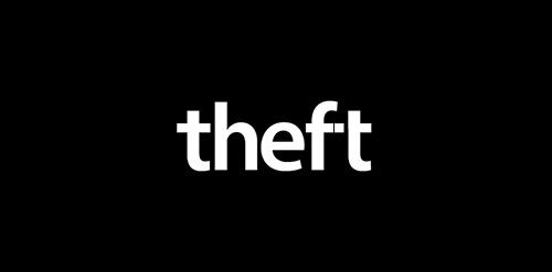
Conceptual logo to show theft using the letters.
 0Feb-13-14
 0Jul-16-09
Logo design for a company in theatre productions.
 0Oct-13-13
Unused proposal for an Italian company who make handles for furniture. The logo shows a crest with the Italian flag and a handle in the shape of Italy. The star represents Sicily. For sale.
 0Apr-15-16
willy from the movie this one is better
 0Jun-23-13
Logo Design by fotoclipping.com
 0Aug-06-11
Croquis web design
 0Oct-07-14
Omnibus Film Festival. The logotype is straight forward. The rotating letterform embodies the persistent idea of collaboration. Each letterform is symbolized as a representation of a filmmaker. Filmmakers constantly keep changing every time an omnibus film is created.
 4Oct-30-11
Design made for a company based in a small village called Urk in the Netherlands. They Buy and Sell salmon.
 0Dec-08-11
Brand Brothers helps Archgéo, a consulting and engineering office in archeology and cultural heritage in its full rebranding. Using a minimalist but meaningful graphic, the new identity emphasizes the economic aspect (the tower), the French culture (the hexagon), and notions of quality and sophistication with the font created for the occasion.
 0Aug-14-13
Logo for Japanese food delivery service.
 3May-04-12
Unused concept logo for royelly.com. For sale.
0Jan-26-14
Designing a unique and bold mark for a student card for university students to receive discounts at food and drink venues. First concept I came up with. They want the 19 in the logo. WIP. Complete project on Behance: https://www.behance.net/gallery/16985931/Nineteen-Card
0Jun-12-14