Oxus Aviation
Oxus Aviation

- Oxus Aviation is a company that specialises in the brokering of deals between airlines and sourcing of planes and engines for their clients.
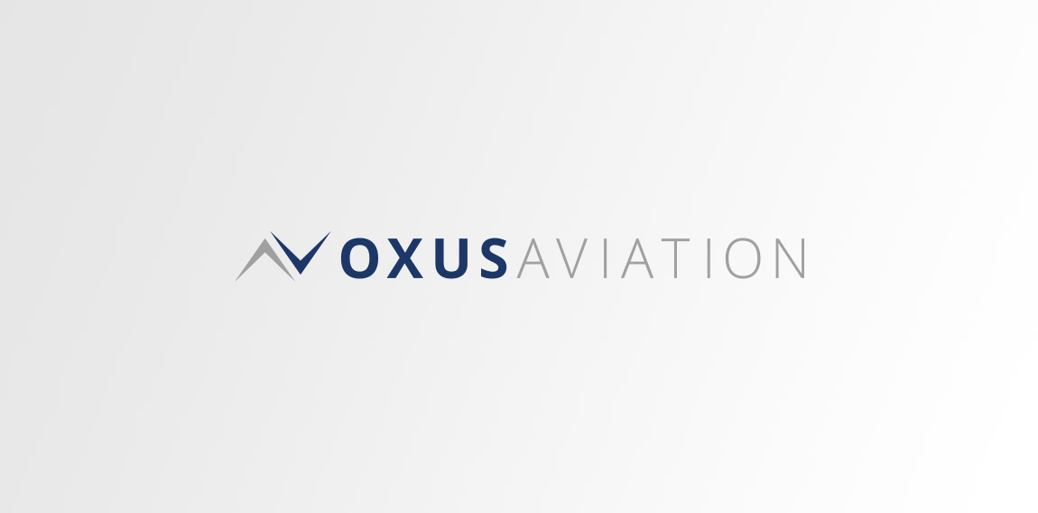
They wanted a logo that would represent them, without falling into the bracket of ‘obvious airline company’. I opted to go down the route of utilising the wings of an aircraft in an abstract way.
By having one arrow facing ‘North’ and one facing ‘South’ the connection to the brokering service provided by Oxus is apparent in the ‘trading’ nature of the symbol. It also offers a nice reference to the global nature of the business and that any direction is possible.
It was made clear by Oxus that they wanted to use a dark blue as the main colour for the logo, I complemented this with a mid grey of clouds to give a real feel for the sky.
 Designer: The Logo Mark
 - Submitted: 10/21/2016 • Featured: 11/24/2016
- Stats: This logo design has 7165 views and is 0 times added to someone's favorites. It has 7 votes with an average of 3.43 out of 5.
Designer


