Most viewed logos – Page 233

Client work. The company involves in webdesign.


BYOLA.com - fresh, bold and green brand.
Custom typeface design.
more at: http://RadekBlaska.com

Logo for a company that specializes in energy saving lighting.

Suit&Tie – wedding video, Poland
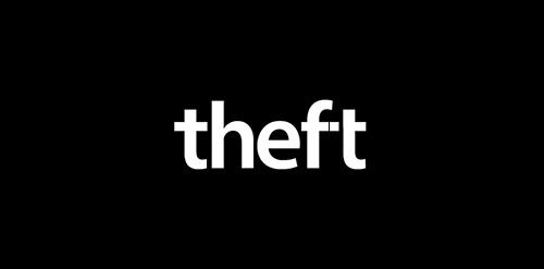
Conceptual logo to show theft using the letters.

Logo For CWJPP a comprehensive golf instruction program that provides weekly structured practices to junior golfers at Carlton Woods.
Logo for the brand dermatological remedies, made from natural ingredients, to industrial workers.

A mark for a sports supplement supplier called 'Stackz.' The concept was to create the letter 'S' from stacked elements.

Logo for the company producing the paper in various formats, colors and textures.
FALLON is fresh modern dynamic brand with short easy memorable name. It will suite well to any business or industry.
Netbox

4hands is a design studio based in Belo Horizonte, MG, Brazil, specialized in manufacturing high-end cajons.
Final logo for Amoun Group.. Amoun Group included a hotel, oriental restaurant travel agency, programing agancy & an advertising agancy.. The logo reflect all themes of those companies, Arabic theme (letters) and ancient Egyptian theme (the shape looks like Horus Eye)...

Farowind concept / www.nlogo.pl


Logo for fruit

Logo for competition - Gdynia Design Center in Poland.

Coworking

casual wear clothing brand
Landscaping & Gardening
Human resources company.
Half-symbolic, half-typographic concept. I have started with a concept of a road leading ahead, with a guiding star above, showing the way. Then, I had to add top serifs to get the letter "T", and with a little stretch of imagination it could be interpreted (or rather the negative space it creates) as the night-sky`s sphere.
I am pretty happy with the shape I have ended up with. It is purely geometric, simple, elegant, unique and strong. Of course it is also the initial of the company name, and the hidden message can be viewed as added value.
keywords: "T", professional, trustworthy, solid, experienced, elegant, simple, guidance

Logo for the Polish School in Hague (Stichting Poolse School Den Haag). Stork is the symbol of the city. He is wearing mortarboard. National accents are flags on sides of the sign.
This is my personal logo. AK monogram from my initials.