Highest rated logos
Highest rated logos – Page 71

Knight's workshop, manufacture of knightly armor.


Hands and leaves in negative space.

Jewelry store

ENTERTAINMENT COMPANY

Unused concept. Just for fun.
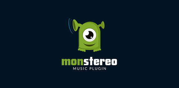
Logo for music plugin MONSTEREO

Lion!

Logotype for photographer freelance

Logotype made for devamjewelry.com - manufacturer of unique & luxury jewelry adorned with diamonds and gemstones. • • • Made for Twindots (UK) • • • Follow us on www.instagram.com/triptic.pl
Superb logo for ranch or farm or creativer studio. For sale.
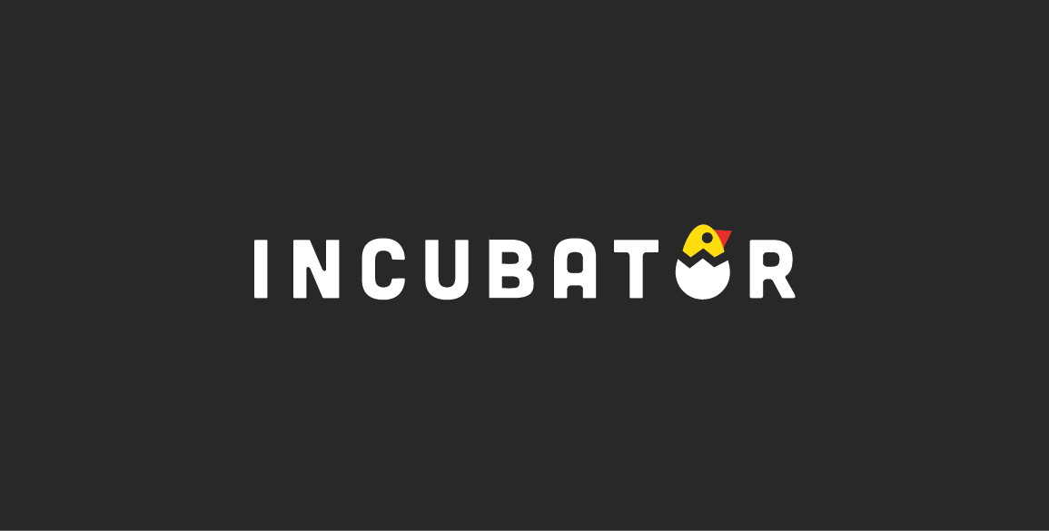
Incubator

Wedding Agency

A nice logo suitable for spa saloon, dating sites, dental, cosmetics. Could easily be adapted for singing events, evening events with singers and actors newcomers. Simple and easily reproducible.

Just done for fun

logo for arts education program for children

Some experiment about verbicon, i hope you like :)

Manufacturer of dairy products.
Concept logo for the music industry.
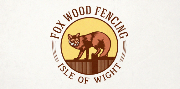
Logo for Start-up fencing company on the rural Isle of Wight, UK.

Logo for Marketing Communication Association (unrealized)

Logo concept for a boutique consulting agency.

Logo was created for fun. Logo is designed for fans of books
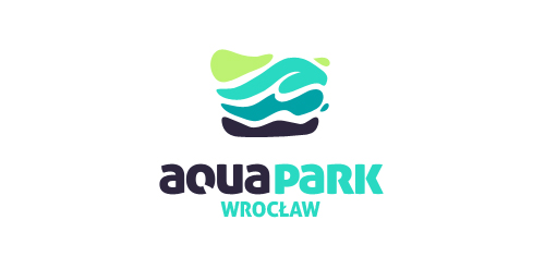
Competition project for a new logo AquaPark Wroclaw, which was awarded from among hundreds of works.
Logo concept for a BBQ restaurant. Gallery: http://goo.gl/fqhsa