Highest rated logos
Highest rated logos – Page 74
Made a logo for fun.


code concept typo

golf

Form movie maker
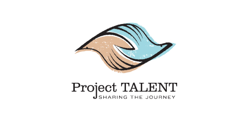
Unused proposal for an education-based initiative to reconnect with participants of a 50 year-old national survey of high school student aptitude in math, reasoning, and language. The current initiative aims to share these participants' stories from the past 50 years, and the collected data could be used in a variety of academic, economic, sociological, and health-related ways.
This mark is steeped in uplifting, motivational symbolism. It's constructed such that it could represent two hands clasped, two birds in flight, or even one hand cradling or releasing a bird. The hand-drawn line quality, typography, and offset color evoke a nostalgic '60s feel. Unused proposal.

Search Engine Optimization

Customizable Ready Made Logo Design http://wp.me/s4571j-moontech

Producer of timber houses.
The client wanted to emphasize quality, nature, beauty, uniqueness, trust and avoid references to traditional symbols (roofs, doors, windows, buildings) used within this industry.
music label

Handmade soft toys
A logo design with a baby holding a toy giraffe.

.
Logo for publishing company.
Logo for media company.

Logo for a modern teahouse.
Talius by Boldflower Design Studio,contact me: meksikositi@gmail.com

Logo design for a company which provides relocation services for expats based in Netherlands.

Children's banquet room
Tutti i fiory (italian) - all flowers. Floristic studio.
Status: Logo & Basic Logo Manual Client: REFRESHER Brand/Logo Name: facebook/filmkult Project: Logo & Brand Mark Design Logo Designer: Miro Kozel Tools: Adobe Illustrator CS6 Year: 2014 __ © Miro Kozel // mikodesign.sk

The idea of the logo was to take letters O and X and put them together to create round area of the blue sky as a background and the shape of a white plane as a letter X.

Portal of cute animals photos
Logo for travel agency, not approved version.

Ecological home builder logo.