Highest rated logos
Highest rated logos – Page 120
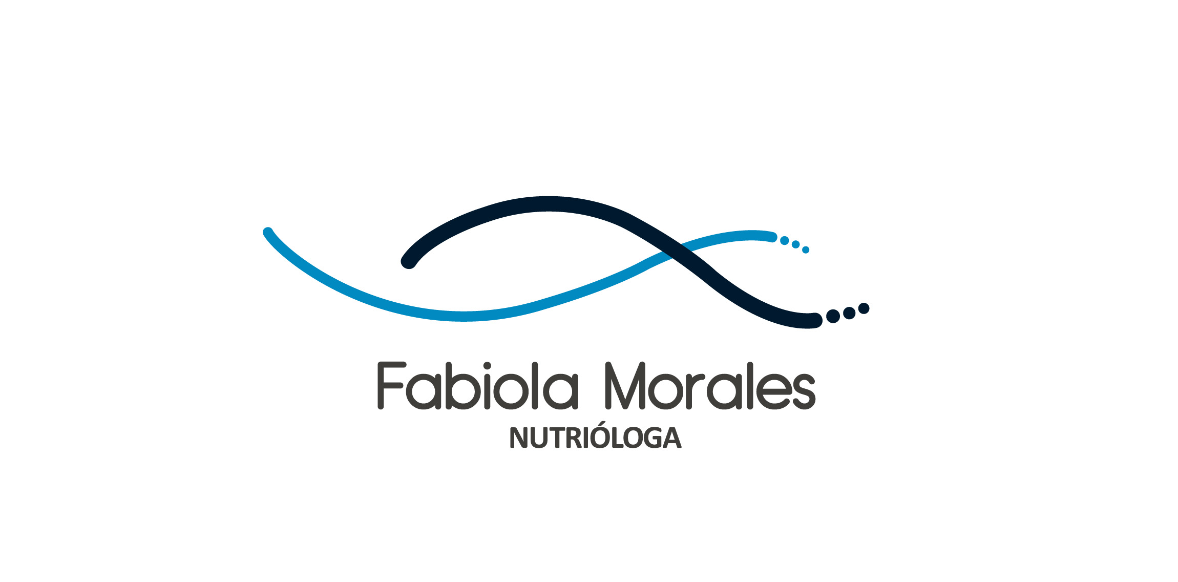
logo for a nutrition specialist based in mexico.


This is sign for woman-copywriter, who write texts at aristokratic style

Negative space logo

Ready made logo design.

White Eagles combat clothes is a company from Zrenjanin, Serbia which manufactures combat and military clothes for everyday and specialized use from exceptional materials.
Slees is a manufacturer of chemical products.
Designer: Piotr Ploch

HELLHOUND is fresh modern dynamic brand with short easy memorable name. It will suite well to any business or industry.
Design and Development Services

This is the logo of a Interactive Agency that develops fresh work in Lima, Perú. The color and the well designed logo it is a combination of what this award Agency wanted to portra,y its desire for innovation and professionalism at the same time.
Restaurant Logo

Logo proposal for a gaming studio

Ticket shop.

logo design for library
spicy restaurant

clothing & accessories

Logo for a non-profit community service

Ready made logo design.
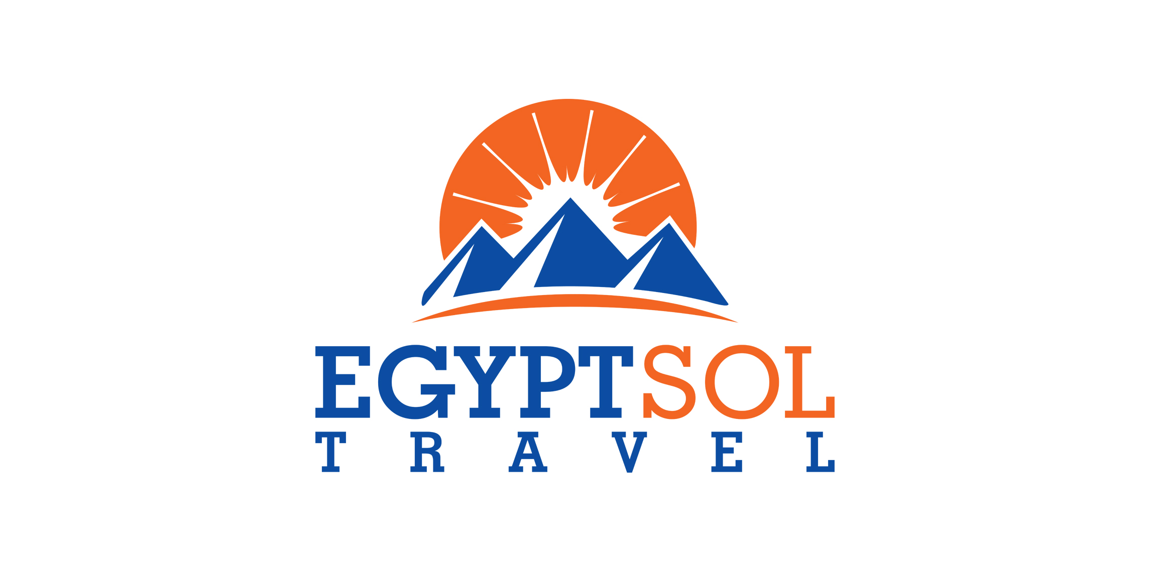
Logo for a travel agency located in Hurghada, Egypt "Sol" means sun in Spanish.

Brand design for nutritionist. 2017, Dourados, Brazil Brand concept: Knowledge for a healthy life. Heart + Fruit + Tree (symbolizing life, health, knowledge and growth).
Amaranth Bars

Light household structures.

Logotype for website about Sochi town

bulb n candle

"Mermaid" is the name of a seaside resort.