Featured logos
Featured logos – Page 302

Whitewood Studio is a modern commercial photography studio located in Northern California specializing in commercial, advertising, and stock photography.


Finally project ..

Ten small mountains forming one big mounTEN.

The direct marketing logo represents a marketing agency. The arrows in the logo represent the communication back and forth. This logo could also be working for any other kind of company. You can buy it here: Direct Marketing

Camerton (tuning fork) - the sound standard (Russian word "камертон").
"Wine's Camerton" – the standard of the best wine.
Logo for wine shop (noble wines)..
associative play

For fun.

This logo is most suitable for some kind of technology c.ompany. This doesn’t mean that it couldn’t be suitable for any other type of business, because it might even fit yours. You can buy it here: My Technologies

Logo for Group Communicators

Logo for Good Taste Festival - Polish nationwide culinary contest for restaurants.
Short wordmark made from longer word- sitiaktus

Invisible technology!

FairPlay is a sports & cultural marketing agency. We chose to design a colorful identity, that could also change and evolve. The logo consists of a shield - evoking the prestige of major sports clubs, with a left side wearing stripes (meaning fair, straight, respectful) and a right side reprensenting the "play" side: curves, meaning creativity, fun, and competition.
The Espace Faubourg, a few steps from the Elysee, is a place for conferences, meetings and events, and also a think tank and an art gallery.

Numerissimo is a company located in Paris specialized in scanning, archiving and editing technologies, with a strong innovative and creative potential. Brand Brothers designed the graphic identity and branding, with a logotype that reminds technicality and graphic works in a simple, pure and creative spirit.

Brand Brothers created the visual identity and branding of this young delivery company with one goal: make it attractive and promote a business whose communication is often neglected by creating a recognizable brand with a strong visual, playing with the main transportation codes.

Bepax is a newcomer in airline companies representation and aviation consulting, based in Paris. Brand Brothers designed their visual identity, based on an original typography, and produced a print and web branding that gives Bepax an image in contrast to its competitors.
Sports and lifestyle dedicated portal in London, Totallysportsinlondon comes in a 60-page bimonthly magazine, a website and travel offers to the British capital. Brand Brothers was given the visual identity, print and web art direction of the the brand and started a graphic so british and dandy.
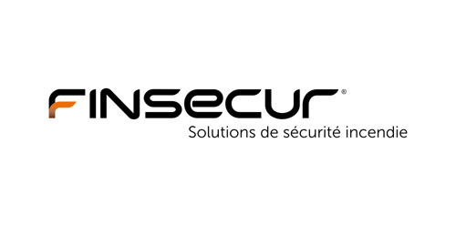
Finsecur is a manufacturer and a French leader in fire detection systems. With competitors like Siemens or Tyco and clients such as M6 or Air France, the company needed to acquire an image to match its ambitions. Brand Brothers has been working since January 2010 to develop the new global visual identity and branding of Finsecur.

Reseller and consultant, specialist in interactive solutions for education and businesses, Motiv'Solutions is operating in a booming market. With an innovative and complete strategy, the company offers complete solutions: consulting, services, installation, training... Here at Brand Brothers, our challenge was to design for them a professional and reassuring visual identity and branding, that would leave a mark in people's minds.

For a manufacturer of instrument strings - Guitar, Cello, Violin, etc. Nickel Steel, Phosphor Bronze & Nylon. The mark is inspired by an Australian Lyrebird.
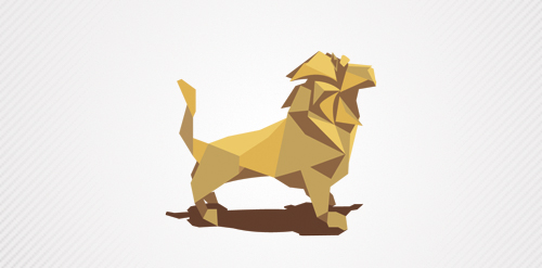
a lion created whit paper!
Modern business center
Yoon freelance designer, personal sign.