
Hayes Image
 Joined September 2010
 37 logos
 http://www.logomoose.com/members/HayesImage/
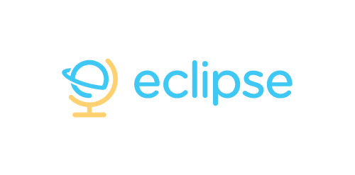
Eclipse offer specialist training software - mostly linguistic, but also teachings on grammar, syntax, etc. The use of the globe device reinforces the idea that language & communication is a ‘global’ exercise. Conceptually the design is of course inspired by a globe on its axis/stand. Since the idea of the eclipse is not necessary representative of solar or lunar, the mark focuses on how eclipses are created, orbit – The precise moment the Earth/Moon orbit is in relation to the Sun. The planet also forming an abstract E, creating a subtle monogram.


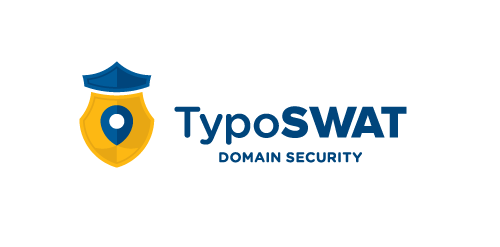
Web domain security, a seek & destroy service for irradicating false domains similar to your own that contain harmful or misleading content. Company outline, by one of the TypoSWAT founder's; "TypoSWAT is a start-up originating from Cracow, Poland. Our main goal is to protect on-line businesses from cyber and typo squatting on their domains. Our expert knowledge comes from years of work in the domain industry and now we are on our mission to kill scam, phishing and affiliate money draining from domain typos. Our key clients are various businesses which also run on-line affiliate programs, e. g. on-line payday loans or insurance brokers. Other businesses like web portals, e-shops, etc. can also greatly benefit from TypoSWAT by protecting their domain assets against cyber & typo squatting." The concept here is the badge represents the protection provided to the user's domain (map pin).


Accuras is an engineering/pre-fabrication company, specialising in steel sheeting & roofing solutions. Blue & yellow represent Accuras' product durability over of conditions of extreme heat & cold.

In development for Uberri, a new children's clothing label based in Australia. Target market is 5-12yr old girls, largest output is summer, beach wear & related accessories. The name Uberri, integrates with the tagline; Uberri (You are very) fashion concious, it also compares fruit to children - always growing, bright, full of life, etc.

Nomawear is a formal fashionwear startup. The mark based on the top-left portion of the Union Jack, Nomawear are based in Northern English province of Carlisle. The mark forms a abstracted N shape & an arrow leading the eye towards the name.

Developed for a food science orginisation, the goal is to maximise dietry intake for the purposes of weight loss, muscle growth and/or general well being. They also develop meal plans for people with food allergies. The concept; a focus on things like protein supplements, vitamins & other nutrients in their isolated forms - such as whey, the protein strain isolated from cow's milk that aides muscle development. The bottle is half full; therefore the fruit is still growing, when the chemical mixture is at its prime, the bottle will be full & the fruit complete.

Pharmabond are a new medicinal supply company in the US, deal with mostly bulk supply for private practices. The apple represents health; it is a continuous line with a loop implying ongoing health. The loop doubles as a droplet, to symbolise medicine, water, purification, etc. The leaf is also a subtle P. The blue enclosure is a protective seal to ensure ongoing health.

For Neuerlehrer (New Tutor) an education provider. This concept deals with the idea of well-balanced study. The mortarboard of course doubling as a see-saw. General vibe requested was light-hearted/friendly/playful, they wanted a logo the could double as a character/mascot to be used as a guide through the software, remember the paperclip helper from Microsoft Word? Similar/same premise. The represented 'age' of the owl is that of an owl chick, so that it can grow up along side the student.

Developed for my sister's startup. Lilypads & Lemondrops make all kinds of things out of fabric & stitching; tea cosies, ipod covers, stuffed toys, felt decorations just to name a few. The logo needed to be simple enough to either be; stitched/sewn, rubber stamped or paint stenciled onto fabric. The logo will also be used on etsy stores & similar.

Developed for a speech therapist & vocal coach based in UAE, I have developed both a Latin & Arabic typographic solution (see variations). Concept here is 'fun with pitch' - the green swirl represents travelling soundwaves, the yellow bar represents the golden note (or perfect pitch) with the blue bars representing the plus/minus discrepancy, so it’s about precision. There is also an implied smiley face, can you see it?

Devereaux specialise in blends; fruit & nut blends, spice & cream blends, they also make their own herbel tea blends. All their baked goods have a specific blending combination that gives their breads, buns & cakes a unique flair. The mark is inspired by their award winning honey-apricot rye loaf. The apricot stone doubles as a honey wand, suggesting a literal manner of 'blending' both flavours.
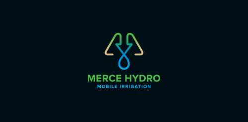
Merce Hydro, a mobile irrigation company based in Northern Victoria, Australia specialise in redevelopment of drought effected areas for the purpose of farming & residential properties. The Mark is based on the use of a water drop, an arrow, pipes & finished off with an M. The arrow symbolises function & the arrow/drop cross section symbolises design - both core factors in engineering & invention of their systems. Green represents growth, their aim. Brown represents destination (drought area) their market. Water represents sustainabilty, their long term plan, and finally the pipe represents management, their ongoing analysis & monitoring of their network.

For a Marketing/PR Company. The concept behind the mark is based on the age-old alchemic practice of attempting to artificially mass produce gold by way of fusion/synthesis with other elements. Since gold has only one stable isotope (the element Au) a massive chemical reaction would need to occur to generate this isotope. There is only x3 active protons difference between Lead & Gold. They're 'chemically' different...reaction to solvents, melting temp, etc...but, if you were to extract those x3 protons from lead theoretically, you would have gold. Things like American Idol employ this 'extraction' tactic...slowly removing the unnecessary protons (contestants) till they have their 'golden result' - a season winner.

For a manufacturer of instrument strings - Guitar, Cello, Violin, etc. Nickel Steel, Phosphor Bronze & Nylon. The mark is inspired by an Australian Lyrebird.

Mail Pals, an in-school program to keep kids writing, setup pen pals & post letters.

Design for an eatery/cafe with new age, vegan & organic menu. Although not exclusively, children/young adults are a target market.


