LogoMoose
  • Logo
    Galleries
    • Featured logos
    • Most rated logos
    • Most viewed logos
  • Identity
    Galleries
    • Featured identities
  • Packaging
    Galleries
    • Featured Packaging
  • Designers
  • Competition
  • Upload
  • Become Member
  • Login

  Perspective logos (14)  

Hexagon

Brand mark for a logo design I've made some time ago.

vamdalistComments0Oct-06-16
TwoPoint Street Library

Logo for library located in an old tenement house on TwoPoint Street

dorianComments0Nov-06-15
ELECTIONS.

Unused proposal.

jeroen-van-eerdenComments0Feb-09-14
PRA architect – Interior – contractor

PRA in English means PRE or before. The logo reflects the company's commitment to details from the early stage of design process. The logo shapes and typo constructed from a specific grid system (that later used as a graphic element) and also suggest perspective. Positive and negative space.

visualcastComments0Nov-25-13
Touché Collective

Touché Collective is a young creative collective from The Netherlands. Check them out at www.touchecollective.com

thebacheComments0Oct-29-12
Garant Plus

Logotype for security company.

hm-himeraComments2Apr-07-12
First Presbyterian Church of Fort Lauderdale

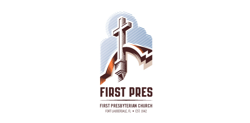
Redesign of the church's old logo in a stylized, illustrative manner, making it more welcoming, contemporary, friendly, casual, & upbeat. Client specified a rendering of the church’s architectural arch and cross in the perspective in this photo, and required an emphasis on the church's nickname, “First Pres."

Here, crisp, exacting vectors emphasize the architectural soundness of the church — a metaphor for the concept of faith as the solid foundation in one's life. This design makes use of hatching to add gradient dimensionality, enabling it to easily reduce down to 1-color. Colors are indicative of the building itself, including terracotta roof. Check my Flickr case study or Dribbble for more images, detail, and full design rationale.

atomicvibeComments2Feb-16-12
Gift Box Creative

Unlock Your Creative Potential

mycahprogramComments0Jan-20-12
Extended House

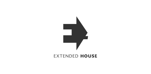
Extended House. Negative space used for the letter E. The house serves as a perspective to this letter E.

abdallah-ahizouneComments0Dec-07-11

  About  

LogoMoose is an inspiration and design community that was launched in 2008. It showcases logos, identities and packaging submitted by professional designers, design studios or agencies. We showcase the best work from the best designers from around the globe. Become a member now and create your own portfolio!

Get your daily dose of inspiration to work on your own design projects and get your business moving. Be amazed by our logos, identities and packaging on this worldwide platform. We‘re here to inspire you and help you impress your clients and fellow designers. Get an overview of global trends in logos, identities and packaging. Browse our galleries and discover all the latest design trends.
We know you love your work!

© 2008 - 2025 LogoMoose.com - All logos are property of their respective owners.
FAQ - Privacy Policy - Imprint