Architectural logos (5)

https://www.behance.net/gallery/40556041/Interespacio- INTERESPACIO: based on the characters of (I)nterior and (E)spacio + celosia. The study came from Mexico. Three years ago, as first instance began with interior design and architecture, then we got and started working professionally. Throughout the time we moved to Argentina and the idea of opening our own trade and professional studio. We needed a nice, comfortable place for people to know us a little more and we could show our knowledge in: products and services


furniture company logo

As an architectural enthusiast, my architectural manifesto explores the synthesis of life in materialized form. It is the agglomeration of ideas being in a phenomenological context. Inventive approach drives me intuitively into uncovering unexpected branches as illustrated in the representation. Golden ratio is employed to invigilate the actualization of the notion.
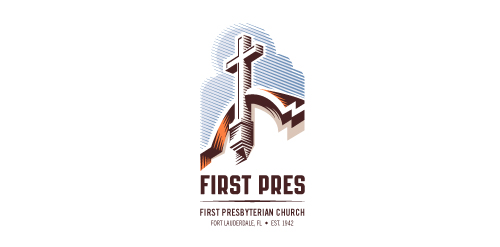
Redesign of the church's old logo in a stylized, illustrative manner, making it more welcoming, contemporary, friendly, casual, & upbeat. Client specified a rendering of the church’s architectural arch and cross in the perspective in this photo, and required an emphasis on the church's nickname, “First Pres."
Here, crisp, exacting vectors emphasize the architectural soundness of the church — a metaphor for the concept of faith as the solid foundation in one's life. This design makes use of hatching to add gradient dimensionality, enabling it to easily reduce down to 1-color. Colors are indicative of the building itself, including terracotta roof. Check my Flickr case study or Dribbble for more images, detail, and full design rationale.

Architectural design bureau. Designing in building. Technical advice. The name "constravia" relates to the scandinavian roots of the bureau founder (construction+scandinavia). The mark relates to the letter "C".