Maroon logos (2)
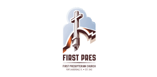
Redesign of the church's old logo in a stylized, illustrative manner, making it more welcoming, contemporary, friendly, casual, & upbeat. Client specified a rendering of the church’s architectural arch and cross in the perspective in this photo, and required an emphasis on the church's nickname, “First Pres."
Here, crisp, exacting vectors emphasize the architectural soundness of the church — a metaphor for the concept of faith as the solid foundation in one's life. This design makes use of hatching to add gradient dimensionality, enabling it to easily reduce down to 1-color. Colors are indicative of the building itself, including terracotta roof. Check my Flickr case study or Dribbble for more images, detail, and full design rationale.


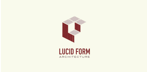
This logo is for a completely fictitious architecture studio called Lucid Form Architecture.
The icon is based on an optical illusion of a cube within a cube. Primarily, the form depicts a big cube, made of wood walls and metal-plated top surfaces, with a notch cut out of the center, resulting in a 3-D "L" shape. However, the longer one looks at this, perception begins to shift, resulting in a couple of different interpretations: 1) a small cube with a wooden wall and metal-plated bottom, in the corner of a room, hovering near the top of a tiled ceiling; 2) a room, tilted 90° clockwise, with hardwood floors, tiled walls, and a cube with a wood countertop and metal-plated side on the floor in the corner. This perception shift is important to the name, because it presents an ironic twist. To make "lucid" means to make clear, and while the icon seems to initially baffle and confuse, it ultimately encourages the viewer to challenge his or her preconceived notions of "perception." So too is the Lucid Form methodology for creating seeming impossible structures.