January 2016 logos (91)

SeKong Hotel


Logo for a stationary and art and office supplies producer.
Logo for a land sale company

Cafe
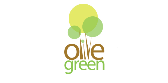
Olive green is an emerging apartment construction company. Dedicated with the idea of not harming the mother nature.Given this situation, logotype identity should be relevant with the name mentioned. Since the logotype was to define the olive green and maintaining green nature. The logotype was made out from the concept design of olive tree and the color combination was maintained as such in nature. With the idea of olive tree, we integrated the name in between the tree on its own wooden color. And the green was made out in the same color to represent the green environment preservation.

Logo for school of psychiatry.
Just for fun

Logo for gas company

crafts logo design
Dieduong logo

doctorio – Internet marketing

couple years old logo slightly refined
This logo was made for the company to provide car rental
Sirotek & Gemerle is an advertising agency based in Prague. The logo combines initials of the founding members with an ampersand.
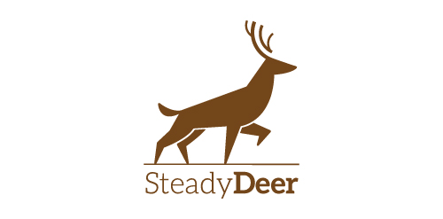
Logo exploration on an animal curious deer This was done just for fun But if you're interested in this logo it is for sale Thanks for clicking

logo of freelancer

I tried to make logo for myself to put it in photos, projects etc. I am looking for constructive critique. :)

This is a logo for a store selling stationery and fashion I want to use gentle modern font. the highlight of the logo are trademarks price

Logo proposal for insurance broker. It shows a bird (eagle) in negative space of "A" letter.
NII - The logo design project for a freelancer group who develop and implement the application on iOS. NII not only means "Nothing Is Impossible" but also is their criterion.

For purchasing contact me.
OWLON is fresh modern dynamic logo with short easy memorable name. It will suite well to any business or industry.

Identidade Visual Tambo Álamos

Kids