Wave logos (39)

They made and serve only healthy smoothies and soups. All hot and cold drinks are freshly prepared using a blender.


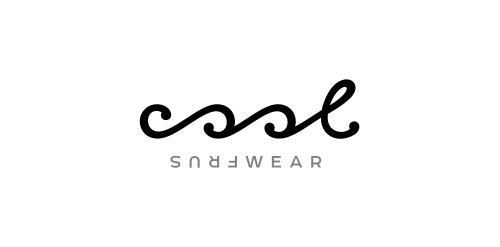
Typographic logo for water sportswear brand that expresses the waves & turning just like in the surfing.

An elegant logo for playful spirits.

Logo for a home decor business. The mark represent's the companies initials CQ and the sun, sea and scenery of the Caribbean.

Developed for a speech therapist & vocal coach based in UAE, I have developed both a Latin & Arabic typographic solution (see variations). Concept here is 'fun with pitch' - the green swirl represents travelling soundwaves, the yellow bar represents the golden note (or perfect pitch) with the blue bars representing the plus/minus discrepancy, so it’s about precision. There is also an implied smiley face, can you see it?

Surfboards Bonjour!

Surfboard company!
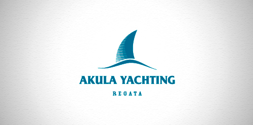
Designer: Denis aristov Client: Sailing Federation of Perm Region Industry: Sport Keywords: regatta, sport, yacht, wave, shark, dorsal fin, sailer, blue
music label
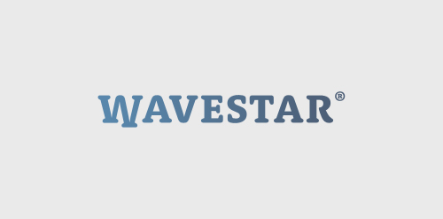
Logo for Danish Wave Energy company "Wavestar". As seen on their website www.wavestarenergy.com