LogoMoose
  • Logo
    Galleries
    • Featured logos
    • Most rated logos
    • Most viewed logos
  • Identity
    Galleries
    • Featured identities
  • Packaging
    Galleries
    • Featured Packaging
  • Designers
  • Competition
  • Upload
  • Become Member
  • Login

  Flat logos (101)  

Leafdock

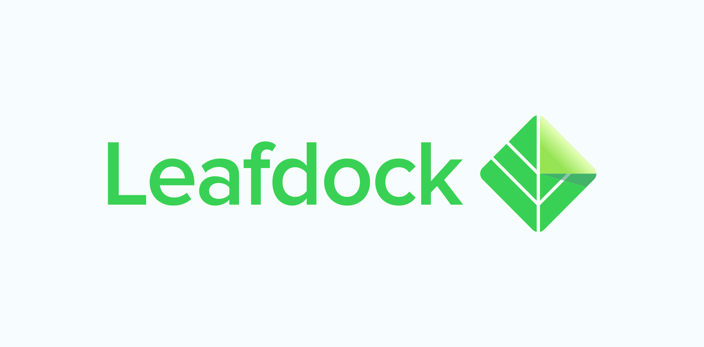
Leafdock is a knowledge management app focusing on easy content creation, powerful search and analytics tool which allows you to work on content that matters the most. Our goal was to create logotype with an independent and recognizable symbol.

sirotekgemerleComments0Apr-12-16
Saturn Travel

Logo for airlines

pczohtasComments0Mar-21-16
SM Monogram

For purchasing contact me.

pczohtasComments0Jan-17-16
Spiral

Spiral - Entertainment and media.

knyleComments0Jan-08-16
A PERSONAL SYMBOL FOR A HERO

An idea of the logo as a birthday present for a person, who is falling into various stories associated with the salvation of people, due to his specific nature.

zlatovaComments0Nov-26-15
InkGeek

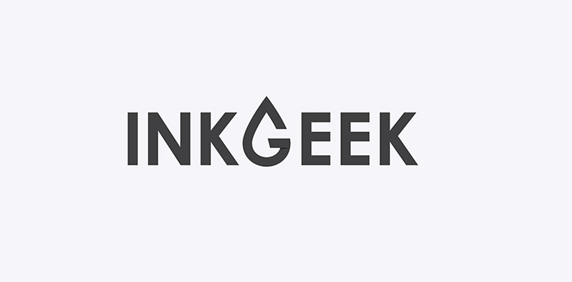
The Inkgeek logo utilizes a minimal and flat design. A typographic G is featured in the shape of a droplet of ink.

cfdesignersComments0Oct-03-15
Lettings London

One of concepts for London based flat rental online service • • • Most important thing was to use british color palette and avoid typical elements as houses, doors etc. • • • Follow us on www.instagram.com/triptic.pl

alekchmuraComments0Sep-27-15
AURORA

AURORA is a brand that design and manufacture handmade scent candles. With a mission to fulfill and inspire people life's with a happiness and calmness. Idea was to design a logo that is simple and iconic. A logo that reflects their brand. Visually and emotionally warm, evoking experience of life. The iconic O letter presents rising sun ( the dawn ).

matijosaitisaComments0Jul-30-15
E Concept

Unused logo design proposal I did in 2013. For Sale!

vasilenevComments0Jun-22-15
TC Photography

For purchasing contact me.

pczohtasComments2Apr-30-15
Down and Up the City

Copyright © 2014 Marius Fechete

mariusfecheteComments0Dec-20-14
Edka Digital

Edka Digital is an independent, digital creative agency located in Barcelona.

edkaComments0Sep-23-14
Miodowa

Miodowa is the name of the residential estate at Miodowa street in Wroclaw. Miodowa is an adjective used to describe something that tastes like honey. That is why we join 3 themes in the logo: honeycomb, architectural design and letter M.
Designer: Piotr Ploch

motyfComments2May-04-14
Squegg

Square Egg, Squegg!

djcdesignComments0Apr-30-14
Funbike

Funbike logo

pczohtasComments0Apr-24-14
Panczel Otto Videography

Videography Logo

pczohtasComments0Apr-20-14
QUAQUA

QUAQUA is a Fashion brand

dumindaComments0Feb-06-14
Page 4 of 5‹ Prev12345Next ›

  About  

LogoMoose is an inspiration and design community that was launched in 2008. It showcases logos, identities and packaging submitted by professional designers, design studios or agencies. We showcase the best work from the best designers from around the globe. Become a member now and create your own portfolio!

Get your daily dose of inspiration to work on your own design projects and get your business moving. Be amazed by our logos, identities and packaging on this worldwide platform. We‘re here to inspire you and help you impress your clients and fellow designers. Get an overview of global trends in logos, identities and packaging. Browse our galleries and discover all the latest design trends.
We know you love your work!

© 2008 - 2025 LogoMoose.com - All logos are property of their respective owners.
FAQ - Privacy Policy - Imprint