
Company Folders
Company Folders, Inc. is a print marketing firm offering quality logo design services at reasonable prices. Their expert team has decades of combined expertise, helping them to design custom logos of all types - including brandmarks, wordmarks, lettermarks, combination marks, and emblems.
 Joined September 2015
 20 logos
 http://www.companyfolders.com/logo-design-services
The Russell Patterson logo creates the "RP" logo using negative space. Its color palette is also reverse of what's expected—instead of dark symbols on a white backdrop, it uses white on a dark backdrop.


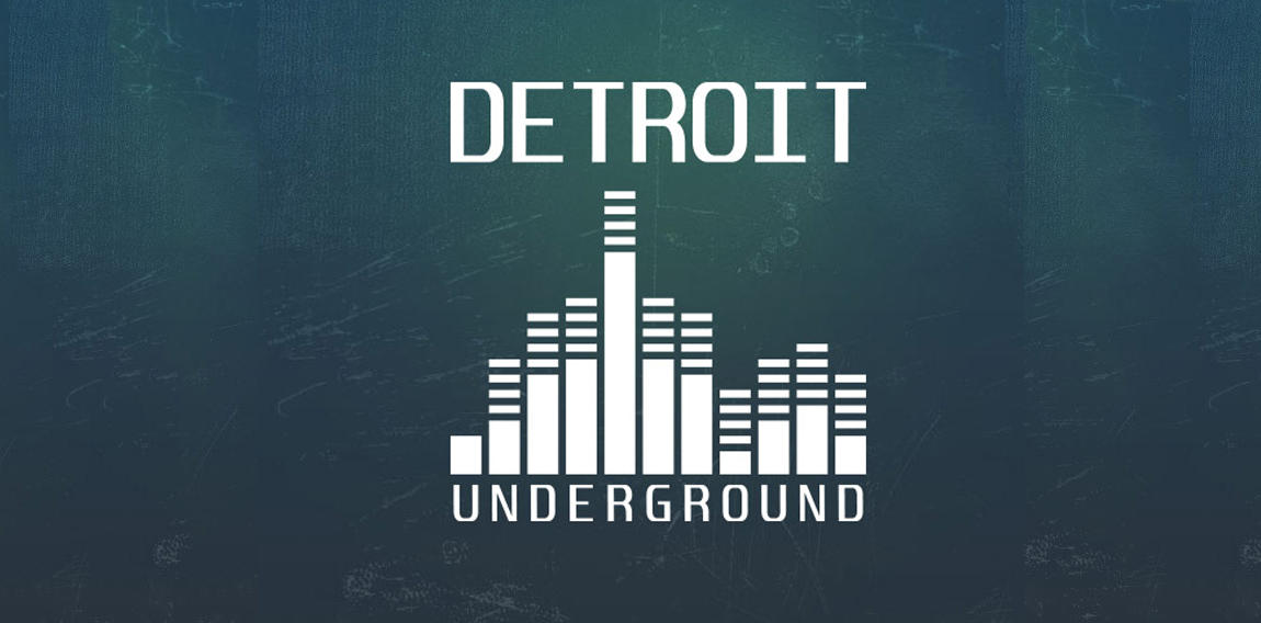
The Detroit Underground logo utilizes a flat minimal design, also featuring a graphic that resembles a skyline and a volume equalizer.


The Cake Fairy logo's illustrative style and chocolate-colored color branding add a cute retro style—and spark viewers' cravings for chocolate cake.
The Randy Parker Photography logo combines gold type with a metallic effect on a black background to create an elegant, high-end look.
The Ocean Palace Luxury Resort logo features a minimal black and white color palette to keep the focus on its intricate symbol, which bears a crown in the middle to imply luxury.
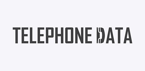
A no-nonsense sans serif font sets a professional tone for Telephone Data's logo, but one letter contains a surprise—the "D" is shaped like a phone.
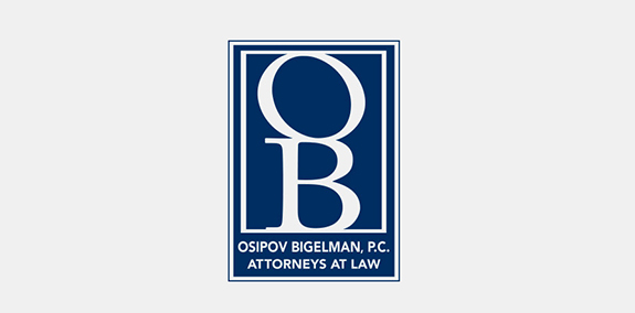
Dark blue and white color branding give this law firm's logo an elegant look. The OB monogram creates an easily recognizable symbol, while the text below it spells out Osipov Bigelman, P.C.'s full brand name.
The Green Hills Real Estate Group logo builds a house out of shapes in various shades of green, a clever design that emphasizes the brand's name.
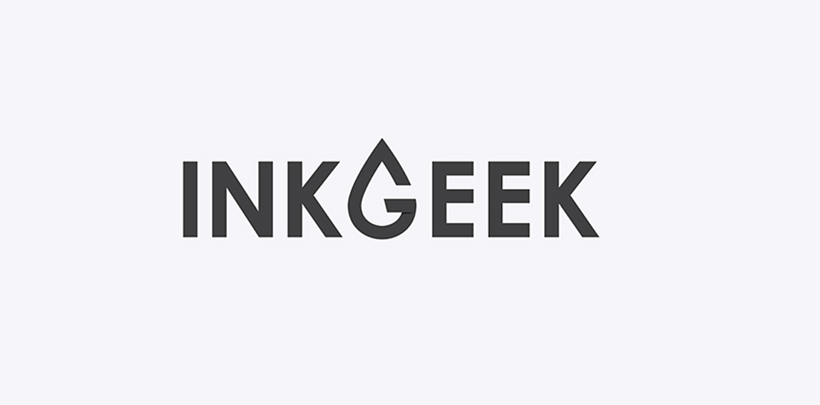
The Inkgeek logo utilizes a minimal and flat design. A typographic G is featured in the shape of a droplet of ink.

The Motor City Chop Shop logo features a flowing action, created with curved letters, lines and shapes. All of these elements combined create a raw, compelling feeling of a chopper in motion.