Most viewed logos – Page 76


logo for a fashion label .

100água is a company that has a special technique to develop products to clean vehicles using carnaúba wax, which uses no water. Besides protecting the environment, it also protects your car more than a regular wash.”

Porter Mason is an authentic beer brand with deep-tasting specialty recipes and vintage feel.

Galaxic- music and video clips search custom type http://www.facebook.com/yaceky
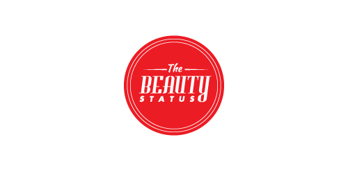
This logo was created for a hockey blog that discusses the good and bad things going on in the hockey world. The logo is meant to look like a stamp and is used to grant 'TheBeautyStatus' to certain players and teams.


Sfera by Boldflower Design Studio Contact me: meksikositi@gmail.com
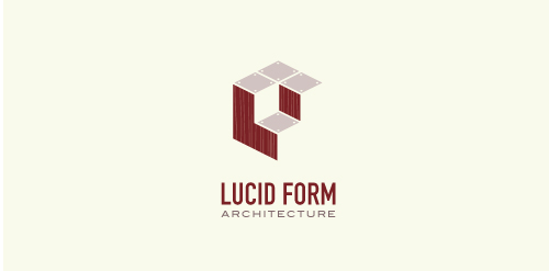
This logo is for a completely fictitious architecture studio called Lucid Form Architecture.
The icon is based on an optical illusion of a cube within a cube. Primarily, the form depicts a big cube, made of wood walls and metal-plated top surfaces, with a notch cut out of the center, resulting in a 3-D "L" shape. However, the longer one looks at this, perception begins to shift, resulting in a couple of different interpretations: 1) a small cube with a wooden wall and metal-plated bottom, in the corner of a room, hovering near the top of a tiled ceiling; 2) a room, tilted 90° clockwise, with hardwood floors, tiled walls, and a cube with a wood countertop and metal-plated side on the floor in the corner. This perception shift is important to the name, because it presents an ironic twist. To make "lucid" means to make clear, and while the icon seems to initially baffle and confuse, it ultimately encourages the viewer to challenge his or her preconceived notions of "perception." So too is the Lucid Form methodology for creating seeming impossible structures.

Sorry for reupload - deleted this accidentally :/


A positive logo that depicts a sun in the negative space making it's way through friendly clouds!

Logo Bissonets french pastry

Airbnb proposal
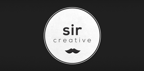
Logo design created for Sir Creative, my online freelance portfolio identity. Visit me at: www.sircreative.com
Email me: art@sircreative.com

Please do not use the first one. The color was off

Dumma Branding is the design house of Duminda Perera. Duminda is currently involved in an ongoing logo project for design every day one Original, Clever, Wordmark/Verbicons or Negative logo.

Children's banquet room

Burger Planeta fast food logo for a training and my personal 30 Day Logo Challenge.

Logo for a dance school... A music note embedded part of the body shape...
