Most viewed logos – Page 78

CoffeeCard is an app which allows you to keep all of your coffee loyalty cards in one convenient location on any supported platform (iPhone, Android).


Yoon freelance designer, personal sign.

Fideon - sign: pile of ideas with the letter F on the top of the pile ;). Logo for web portal (crowd funding).

child photography
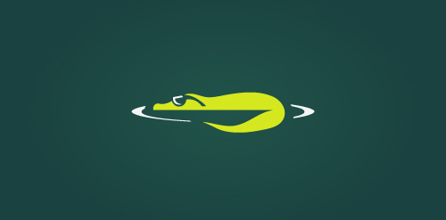
Unused concept. The logo depicts a cool crocodile!
Logo design for photographer.
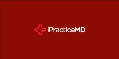
iPracticeMD is a nationwide medical billing and revenue cycle management firm in the US.


Customizable Ready Made Logo Design at http://wp.me/p4571j-5a

Approved logo for expose. The type is created from zero. I went for a rounded approach to communicate a friendly and inviting feel. The mark symbolizes abstract light beams forming the expose action coming from the edge of the "e" The red/green/blue color stands for light and yellow/orange/red represent the levels of sound volume.

Hotel & restaurant located in the old castle


eBinder is a brand which is into cloud computing and decreasing the amount of paper in accountant companies by electronic archiving. So i thought to have the brand name (E and B) into the logo with their business concept in it..
VillageServe seek to work with village farmers and village communities to solve poverty problems in Africa.

my personal logo "chameleon.design", black-white. Chameleon likes pencil :)

A lightning bolt is formed in the negative space of the letter C.

Color drop

my personal logo

Original brand for sale.


Logo for bio energy forum. Represents air & leaf in the e.
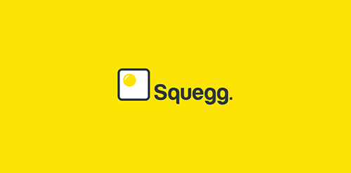
Square Egg, Squegg!
