
Most viewed logos · Page 499
Yourlink is company (human resource) in Thailand

 0Aug-16-13


Logo design by http://www.dannyglix.com/logosandbranding.htm
 0Jan-10-11

Graphic identity for the Oslo based musical group Midi Mantra. Focusing on the word such as Midi Mantra was the starting point of a good idea; we combined these two words to be a creative outcome with a clear visual language and a strong logo signature and a style that follows a certain set of strength and clarity to organize the creative outcome. To top it all we created a visual language that will help the logo/name of the band to come out clearly and communicate the right associations the band want to convey in their visual and musical language. Hoping to leave a massive impression when visual language is carried out amongst other posters on a poster bulletin board.
 0Mar-14-12

 0Dec-08-10
 0Dec-07-10

 0Jan-22-25

 0Dec-11-10

Solo is the margarine brand from Unilever in Belgium. This logo is used for their website with recipes.
 0Dec-20-11

GEEK BEE products with a special and unique brand character. This could be a product brand, logo for a blog, etc. anything that you may see fit.
 0Aug-12-11

Logo for media agency
 0Nov-11-11

 0Dec-06-10
 0Dec-06-10
 0Jan-22-25

Logo for a group of instrumental producers.
 0Jul-15-13
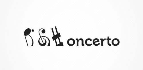
The concept is: subtraction. The name was created by leaving off the first letter of "concerto". So doing the same in the visuals was an obvious choice.
 0Jan-17-13

Logo for new business that enables people to sell their homes privately online.
 0Apr-29-11
Logo for the event "Sofia Jazz Week"
 0Apr-30-13

Logo para bar de São José do Rio Preto - SP
 0Jun-11-16
This was a design that occurred to me while I was working for Birthmark Doulas on another project.
 0Jul-14-13

Web development company based in Brighton, UK. The Client want to show that they're not afraid of controversy and are a creative bunch of folks. You can visit the logo on this site: http://www.camelpunch.com/
 0Mar-02-11

The original logotype had a swoosh to it, so we wanted to make the next logo an "evolution", or "next step" in its look.
 0Dec-22-11
 0Dec-06-10

BP-glass means "bullet proof glass" .....It is the name of the company and also the name of the product that company produces . concept : is making an artistic shape of a BP glass collided with a bullet .
 0Feb-22-12

A small project that i made a shop!!!
 0Oct-23-12