
Most viewed logos · Page 49


associative play


Logo for a russian food restaurant serving only one dish from the soviet union period. Client requested that a symbol from the soviet union will be integrated/present in the logo mark.

logo for publishing company. Features thin sans-serif font with wide tracking a simple book design with hatch shading for added depth. Made in one colour to enable its use on various coloured backgrounds via simple colour change. To be used on stationary, web and on books of various colours.

Logo design for a company creating rich media websites and microsites.

Epro are a manufacturer of childrens creative toys. The logo was developed in reflection of their tag / motto: "simple, creative joy" with the logo composed of simple shapes (based upon a circle) creatively forming a joyful face with an addition of an upside down "r". The type was built from scratch using a circular shape as a guide.


Proposed concept for Creedoo - a youth centered program that provides participants with an experiential learning environment that promotes discovery, a personal and collaborative point-of-view in the context of historic religious faith.

Two commas forms imaginable glass of wine .

Made it for a company named International Commodities
Logo was made for the web-based business management software systems.
Mommy & baby collection - logo. Pacifier + woman (mom) symbol = Mommy and baby. :-)
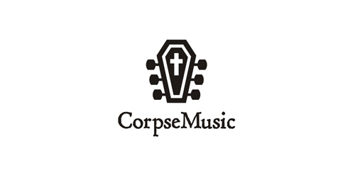
Blend of guitar neck and coffin.

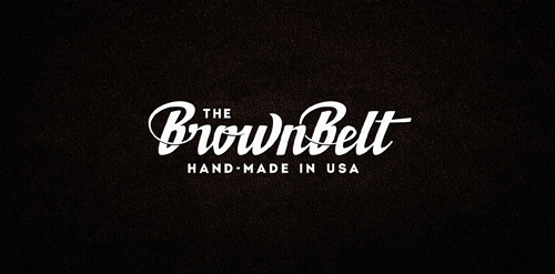
Custom lettering logo for custom made leather belts. :)

Creating logo for BLACKROCK - engineering and construction company that deals exclusively with medical institutions.

photography agency

LOOKER is fresh modern dynamic logo with short easy memorable name. It will suite well to any business or industry
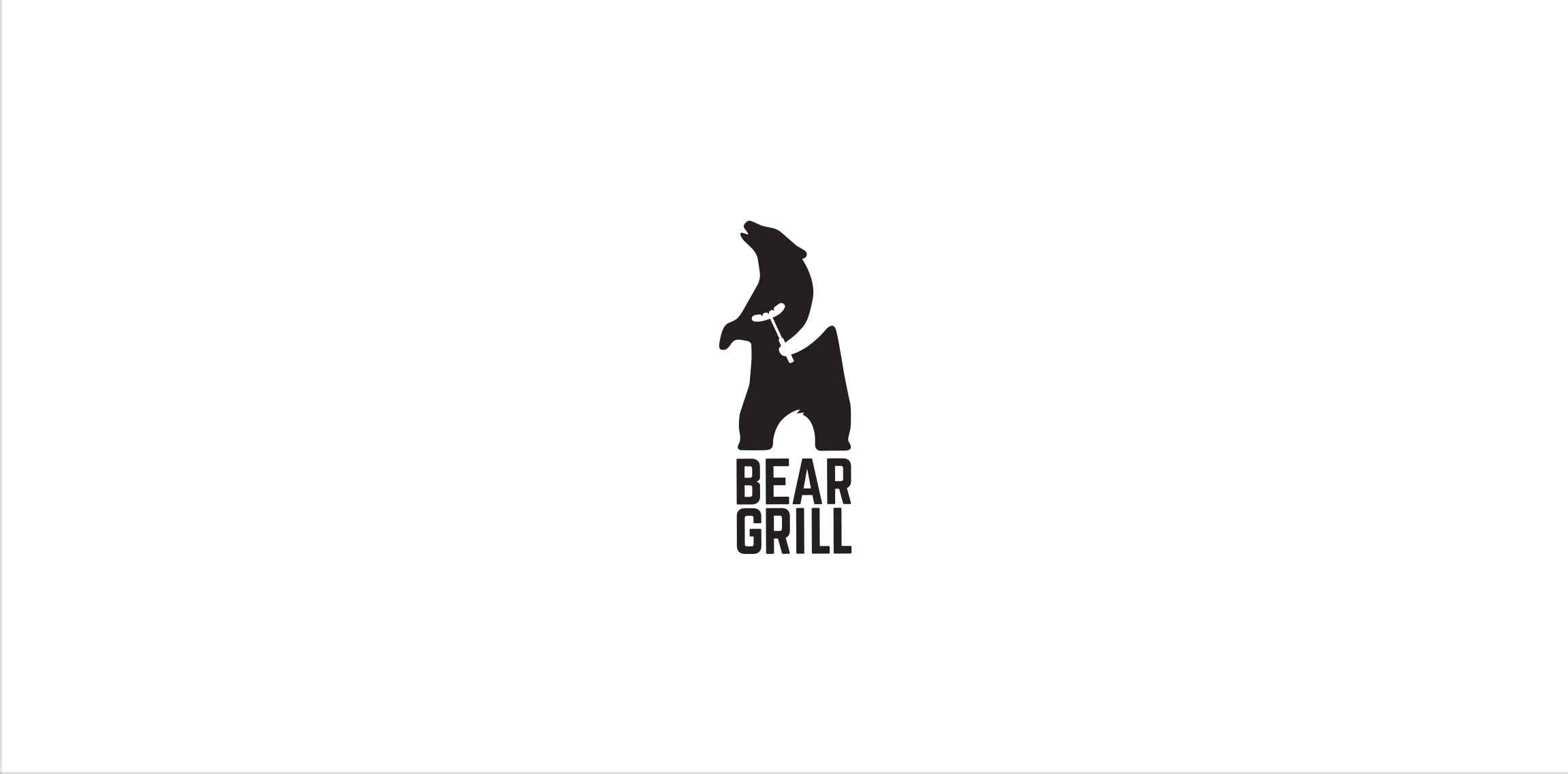
Totally random logo design for a bar offering grilled dishes, training and my personal 30 Day Logo Challenge.
