Most viewed logos – Page 419


Pascana Hotel is located in different parts of Perú. The name comes from a word of the native and official Peruvian language called Quechua, which literally means “A stopover in a trip”. For Pascana Hotel the concept was to represent the peruvian culture at its best. The colors used are a characteristic of peruvian textiles. In this case they give a warm feeling to the Hotel. And the forms used are part of another characteristic of Peruvian culture, that is the use of lines and forms. This one tries to represent a place to stay. Like a native house.

Furniture exhibition "Russia-Asia: Technologies of an interior"

Logo design for a school.

Logo for online store.

Logo design for Underbunny children's clothing line
Logo for E-Cigarettes/Vaping store.


Furniture Factory

Logo for a mobile phone accessories selling company


New Branding was developed to increase recognition and reputability. Being a small Accounting Firm, Sandra wanted something fun that her customers could identify with (Bringing in a show box of expenses).

Logo for Waszkiewicz


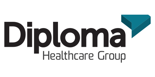
Inspired by the ancient Japanese art of folding paper, the negative space from an origami-styled “D” creates Diploma’s icon. Using a deep charcoal colour treatment on a bold stylized version of the Museo Sans typeface, the identity combines vivid aqua and chartreuse colours, designed to strengthen the company’s fortified position as “the definitive partner for medical device sales in specialized healthcare markets.”

A concept made for fun. Logo of a aquaristic shop specializing in salt water organisms.

Logo for Dance-School

A logo for a new real estate sale and property management group. Based on Metro Rail maps.