

Most viewed logos · Page 27
Logotype created for China based web & mobile apps developer. - - - follow us on www.instagram.com/triptic.pl

 0Oct-07-15


A Construction Company
 0May-30-15
..
 3Dec-20-11
 1Apr-17-09
Pulse concept typo
 2Aug-27-15
 0Dec-07-08
Ready made logo.
 0Dec-19-12
Logo developed for Trevo International (Importer/Exporter company)
 0Nov-23-14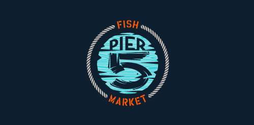
This logo is for a completely fictitious fish market.
The idea came to me when I discovered that it was possible to achieve a fish shape in the negative space within the bowl of the number 5. Dubbing my hypothetical company Pier 5 Fish Market, I created this illustrative mark in the hopes of really capturing the spirit of the nautical and maritime aesthetic. Type is custom for "Pier" and also the number 5, which is hand-rendered to look like it was painted on a wooden sign with a very wide, worn-out, thick-bristled brush. While it was important for the fish to show in negative space, it needed to look like a seemingly happenstance result of logical, real-world brush strokes. This is the minimal, alternate version of this logo.
Click here to see the case study for this logo, which chronicles its development, and includes full design rationale, sketches, electronic roughs, and alternate designs.
 1Jul-04-13
Huge Movie Box. High quality. Huge Collection
 2Jul-12-11
Simple and strong logo for dog shelter.
 0Jun-11-12
A dove created from hands represent freedom, liberty, trust, happiness and simplicity. Naked hands suggest unarmed status which empower the concept of peace. Great choice art, photography and other industries.
 9Jul-15-11
For an online resource through which visitors can donate money to one or more writers (bloggers, journalists, fiction writers, poets, etc.) The mark has a pen shaped in the form of a tree. The water drop along with the gradual change of colors symbolizes the process of “feeding”/ or contributing
0Apr-28-16 5Jun-01-10
 4Feb-25-10
 0Dec-11-08
 2Jan-31-10
Logo for an interior design company. Based on a traditional Chinese decorative element.
 1Mar-22-15
Logo for a Product Packaging Company..
 2Jan-12-13
BEEMUSIC is fresh modern dynamic brand with short easy memorable name. It will suite well to any business or industry.
 0Jul-28-12
a logo design for film making company
 0Nov-04-13
Hand lettered approach on the word "Hashtag" with a smart incorporation of the "#" symbol.
 0Feb-23-16
Logo for importer of alcoholic beverages
 3Jun-30-11
Logo for a street wear company due to launch this year
 1Jul-03-13