Most viewed logos – Page 184

Non-profit Organization in NY


Dance City (Šokių miestas) - Dance Studio Logo

Playing with font for this logo, and using a vehicle for the backing imagery was new. Really fun!

Hypothacare organization

FINAL DESIGN. It is based on the company name, which in turn comes from an abbreviation of "AS UNique AS You ARe". Offering unique, self-customized cashmere products is one of the central concepts for this brand, hence the fingerprint-goat.

This mark was created for Monster Truck Ninja, a motion design firm in Covington Kentucky. They needed to show how something sleek, quiet and Japanese could be brash, loud and American, all in one mark.
Concept logo design in my recent projects, the logo is a combination of two letters in the name brand SM.

Gokids.ro - online portal for kids

logo for investment company

Sunrise

Every muscle of the human form is made from Leafs that represent the Organic muscle's we were careful about the human muscle position.

Windows logo inspired.


Logo for the russian bank.

A hosting company which locate in USA. Using the number of “8″ to be the letter of “g”.

Logo for the photo studio.


Logo for computer art festival

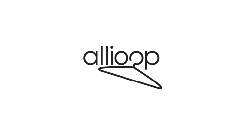
When I was asked to create a logo for a fashion blog and I heard its name, I was excited to begin working on some drawings. After twisting, placing and stretching some hangers I started to draw out shapes and fell, dare I say it, 'lucky', on the perfect idea. The necks of the hangers form the love heart, and it almost creates a star-like shape.
Logo para empreendimento em estância turística muito conhecida no interior do Estado de São Paulo - Brasil.
Logotipo para centro de estética Dourados MS

Zbigniew Herbert
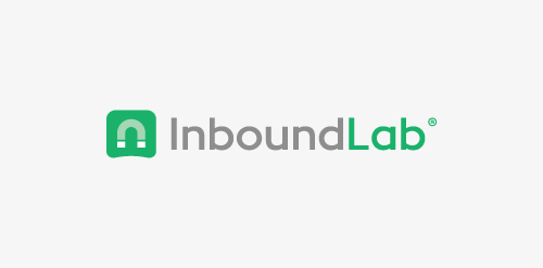
Logo design for inbound marketing agency. We used magnet as a symbol of attracting customers through a series of coordinated marketing actions. Additionally, curved bottom edge enhances the impression of attraction. - - - Follow us on www.fb.me/triptic.design