Most viewed logos – Page 17

...


Adrenaline- polish base jumping team
http://www.facebook.com/yaceky


Huuuge logo search for Taganka Brewery. Full search: https://www.behance.net/portfolio/editor?project_id=63651085
As a degree project, I designed an identity for Korea by manipulating Hangul, the Korean alphabet, to form English alphabet.

Vegan green food restaurant
I like cats. :) Just for fun.

My own logo

unused logo

First - F1rst - wordmark concept.

Logo for an online community.


For purchasing contact me.

drop concept typo
Mert Gündoğdu / Photographer
Rockstar


Flower Store.
Playing with name & letters.

e+n+z+o


Concept logo and name for a client.
It's meant for a talent management programm.
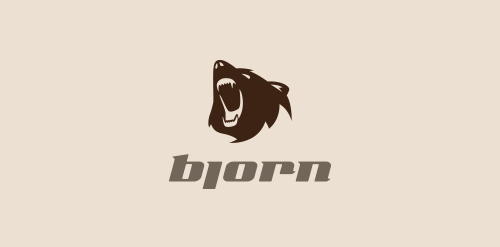
Logo for the tourist equipment distributor, Bjorn. Competition entry.