Fysiosportief
Fysiosportief
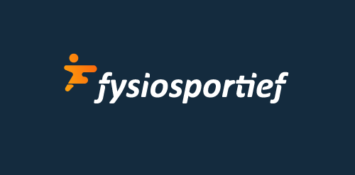


- Logo design for a Dutch sport physiotherapy company called 'fysiosportief'. They asked me to come up with a new refreshing logo for their business. The client preferred the type to be custom and as friendly looking, easy to read and a little twist integrated in it that shows some sort of speed and dynamic.
The icon is a combination with the letter 'F' together with a running human. Also tried to perfect the balance by adding that same shadow effect from the typo.
 Designer: jeroen-van-eerden
 - Submitted: 04/03/2014 • Featured: 04/24/2014
- Stats: This logo design has 10388 views and is 0 times added to someone's favorites. It has 9 votes with an average of 3.44 out of 5.
Designer