

Highest rated logos
Most rated logos · Page 243
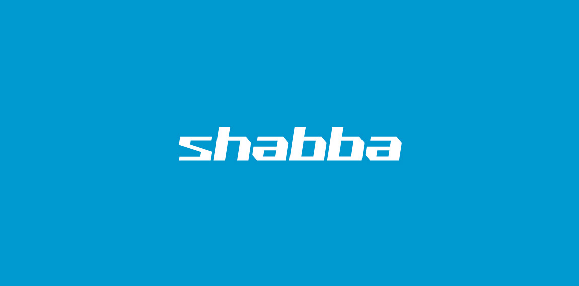
Custom typography unused logotype proposal for bicycle parts manufacturer.

 0Nov-21-15


BrightSword Technologies Pte Ltd
 0Nov-20-15
Another Proposal #SG!
 0Nov-16-15
www.guanodesign.com
 0Nov-14-15
I'm Clém graphic designer, and i created this logo for myself ! I put an pen in the middle bar of the E.
 0Nov-14-15
This is a logo for a company called Explore4 in this logo the number 4 and the letter E are combined hope you like it !
 2Nov-11-15
"Vuông in Vietnamese means Square" Vuong was born in 2010, it came from the passion of art and crafts produced by a passionate artist classic definition of paper, leather and fabric. Wishing to transmit classical values combined with modern designs. Vuong developed models with rich materials from papers, leather and fabrics for applications of daily handmade products. 2013, Vuong created its own Fanpage, with a desire to become a place to serve people in a friendlier and more attentive way.
 0Nov-02-15
Logo for Copper Basin Art Exhibition. Combination of an eye and a brush on a canvas.
 2Oct-28-15
Karbo Private Club
 0Oct-25-15
Logo design for Ricebird, 2011.
 0Oct-23-15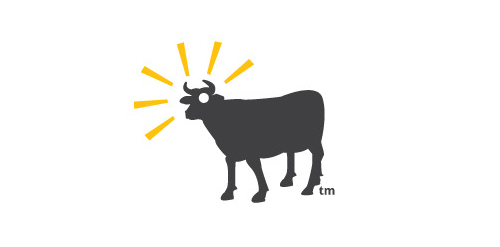
Because is not a cow, get it?
 1Oct-16-15
Rebrand of the current log which is still featured on the website soon to be replaced. Symbol conveys attributes required by the client: 1. lower-case "r" 2. Redbox Platform 3. Connectivity 4. Convergence 5. Virtualization 6. Security
 2Oct-15-15
A rabbit is swimming in the cup of coffee, fair enough.
 0Oct-11-15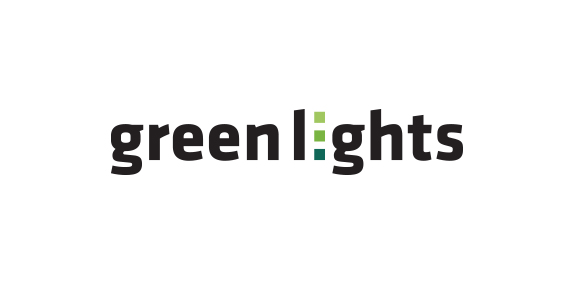
Logo design for band GreenLights.
 0Oct-06-15
Airmist London
 0Sep-23-15
Logo for my own project
 0Sep-17-15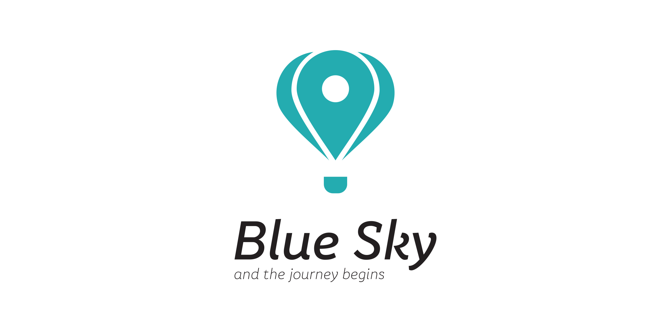
logo for travel agency.
 0Sep-16-15
My new personal logo, inspired on my initial and a check mark.
 0Sep-14-15
Logo designed for private client, who is art photographer based in Poland. M- is from the first letter of the artist name. Logo looks like architectural drawing, because it is supposed to symbolize studio of photography.
 0Sep-08-15
A logo for axe throwing game. The logo is an incorporation a plating card king and axe.
 0Sep-08-15
Elidal logo by Boldflower Design Studio
 0Sep-07-15
StiIig® is a luxury men’s fashion brand from Sweden. Currently exclusively in Japan.
 0Aug-28-15
One of the version of logo for a website that gathers orders for creating websites. The idea for logo was to present pool with designers-fishes that catching occasion-hook to get the order.
0Aug-27-15
Logo for a local business
 0Aug-19-15