Highest rated logos
Most rated logos – Page 242

Rebrand of the current log which is still featured on the website soon to be replaced. Symbol conveys attributes required by the client: 1. lower-case "r" 2. Redbox Platform 3. Connectivity 4. Convergence 5. Virtualization 6. Security


A rabbit is swimming in the cup of coffee, fair enough.
Logo design for band GreenLights.
Airmist London
Logo for my own project
logo for travel agency.

My new personal logo, inspired on my initial and a check mark.

Logo designed for private client, who is art photographer based in Poland. M- is from the first letter of the artist name. Logo looks like architectural drawing, because it is supposed to symbolize studio of photography.

A logo for axe throwing game. The logo is an incorporation a plating card king and axe.
Elidal logo by Boldflower Design Studio
StiIig® is a luxury men’s fashion brand from Sweden. Currently exclusively in Japan.

One of the version of logo for a website that gathers orders for creating websites. The idea for logo was to present pool with designers-fishes that catching occasion-hook to get the order.

Logo for a local business

Logotype done for online learning/teaching/training platform. Mark combines "S" letter with two books and bookmark. www.szkolimy.pl
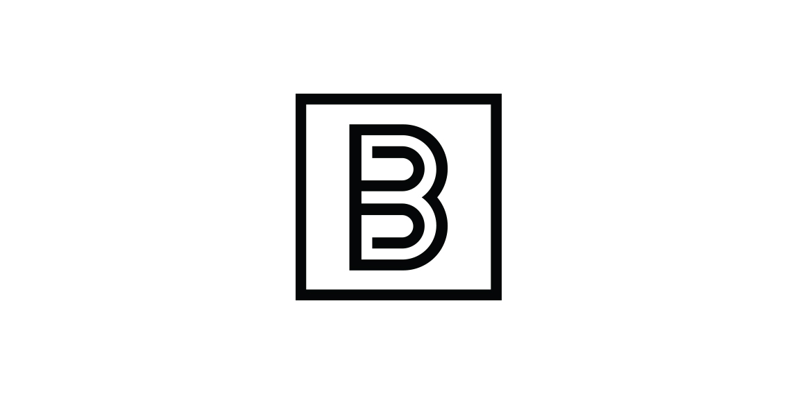
The letter "B" used as a monogram / lettermark logo design. Created in Adobe Illustrator CC 2015 and in use for client.
Personal typography logo.
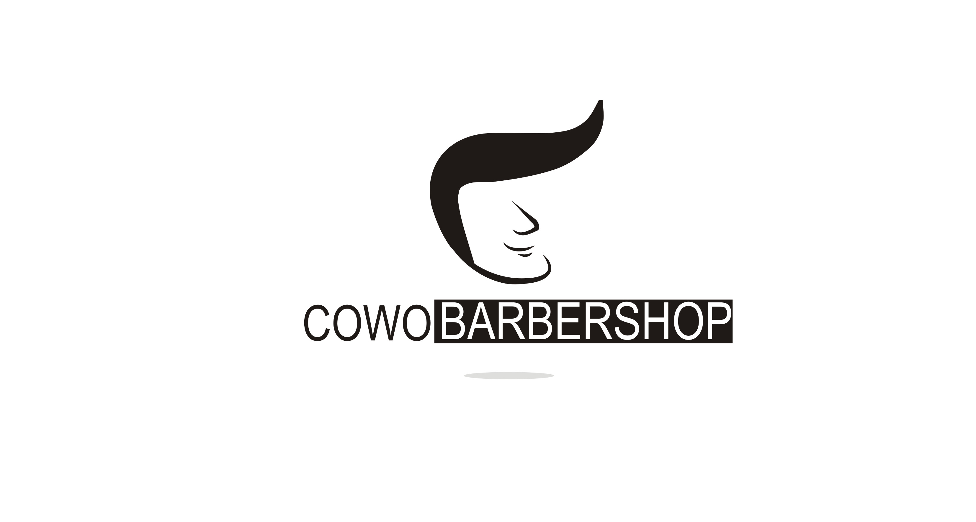
Cowo (In Indonesia) means gentle. Wanna handsome and cool? We made it.

Logo for furniture store.

Logo for a company that specializes in energy saving lighting.

Logo for NeoDieta

Typographical clean TEO logo design inspired by TEDx

Self-brand logo design.

To create the logotype we just integrated the letter 'L' from Live and 'M' from mob, so as to generate the feel of livemob.

This is our own logo designed for initially for this company. Idea behind creating this logotype was just to make it visible ad readable in its simplicity. Since the name CRAZYDES evolved from CRAZY and DESIGNERS , we were keen in making it simple and easy for everyone to read upon. With this thought in our mind, we had created this logotype with the crazy Y letter in between the two words.