Highest rated logos
Most rated logos – Page 241
A logo for a Personal Training service specialising in using the natural elements to aid health.


This is my personal logo, I'm a Tiger in Chinese zodiac.

GENESIS

FISH

Logo for a contest for a logo of Labiszyn. The concept for this logo was to shape the letter 'L' with crossing line (pronounce in polish like W) into a raising bird.

http://wp.me/s4571j-marrow

Logo for school of psychiatry.

my initial in unreal 3D
An eco-friendly logo design for eco-friendly company. The design is made especially for companies that related to green energy. The logo creates a subtle light rays effect that helps capture attention.

Print supplies shop

Logo I made for a Dutch non profit that's all about rethinking our current economics system. It had to be vibrant and geometric to represent the different ideas and opinions of people.
Work in progress on ULKER logo / wordmark
An Elegant Flamingo
Custom typography unused logotype proposal for bicycle parts manufacturer.

BrightSword Technologies Pte Ltd

Another Proposal #SG!

www.guanodesign.com

I'm Clém graphic designer, and i created this logo for myself ! I put an pen in the middle bar of the E.

This is a logo for a company called Explore4 in this logo the number 4 and the letter E are combined hope you like it !

"Vuông in Vietnamese means Square" Vuong was born in 2010, it came from the passion of art and crafts produced by a passionate artist classic definition of paper, leather and fabric. Wishing to transmit classical values combined with modern designs. Vuong developed models with rich materials from papers, leather and fabrics for applications of daily handmade products. 2013, Vuong created its own Fanpage, with a desire to become a place to serve people in a friendlier and more attentive way.

Logo for Copper Basin Art Exhibition. Combination of an eye and a brush on a canvas.

Karbo Private Club

Logo design for Ricebird, 2011.
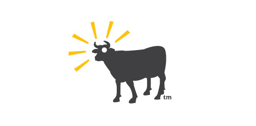
Because is not a cow, get it?