Highest rated logos
Highest rated logos – Page 96

Webshop for graduation gear for schools


Confectionery сompany
Logo design for Aberystwyth based web design company. The logo depicts the shoreline of Aberystwyth and doubles as a mountain symbolic of the Cambrian region in which the company is based.

Tutti i fiori (italian) - all flowers. Floristic studio.

Logo design for the IT company GTP
We recently completed this logo for Townsend Real Estate & Art Gallery in Maine. She wanted the logo to encompass the fresh coastal air of Southern Maine.

My business logo

Consulting services.
http://www.facebook.com/paulvonexcite
Logo for web developer.
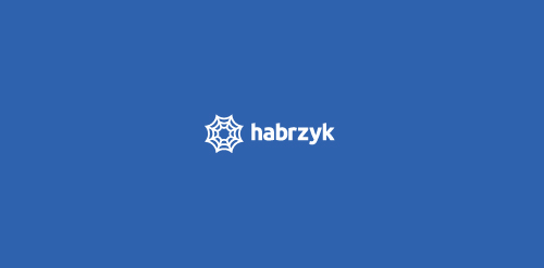
Logo show spider web. My client is building web, as spider is building his spider web. He is also ready to work, you can email him at: kamil.habrzyk@gmail.com
Ready to work - pkowal98@gmail.com
House Logo

Just for fun
Pingwin means penguin.

ONEYE MAN is fresh modern dynamic brand with short easy memorable name. It will suite well to any business or industry

New work is here! Branding and packaging design for a Swiss cosmetic line-up. Check full case study in my portfolio. www.dominikpacholczyk.com

Logo for writers club.

AkirA -Sushi bar
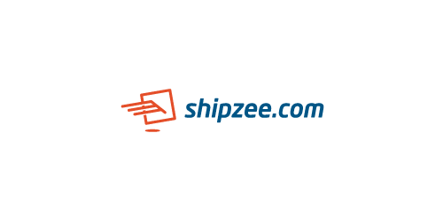
Hi, friends! My new logo for transatlantic shipping company, icon symbolizes package and wings, which means fast and secure service.

spiritual site
花店logo猫爪与花儿
Logo design for website offering e-books, audiobooks and movie adaptations of school books. Basically the idea was to combine classic books into something more digital. Then came the idea of combining open book and screen.

Antivirus for android