
Highest rated logos
Highest rated logos · Page 94

Logo for bio energy forum. Represents air & leaf in the e.


OmniQuest Living Logo
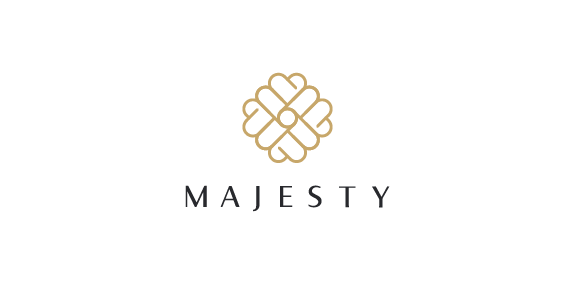
The basic shape of the logo is based on three elements which are, a letter M, a crown and a heart expressing majesty and deep love of chocolate, gold and black are the perfect combo referring to a luxurious palette, Finally the font is a sans serif humanistic with elegant curves, superfine and bold lines showing the contrast and beauty of a high quality, classic, sophisticated product.

logo for Polish Space agency. Several concept combining Poland (as a country shape), rocket/space shipt and orbit.
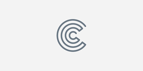
C Monogram

Restyling of the logo for shop of design sunglasses (for hipsters). www.lookatsun.ru

Logo for a stationary and art and office supplies producer.

Logo designed for a Mens Formal Wear Brand

Emblem for indoor soccer team Callippus. The shield forms a letter "C" and "11 (Year of Establishment) The tiger represents our playstyle of rapidity, technique and slyness.

logo for Odnowa fotograficzna

A hosting company which locate in USA. Using the number of “8″ to be the letter of “g”.

Logo for interactive agency

Victoria is a financial fund based in Warsaw. The key was to combine a eagle (symbol of Poland) and V letter (for Victoria). There were several concepts - some modern, some classic, more decorative with a pinch of victorian styling.
For more: https://www.behance.net/LucasCassim

Logo for interior designer


Just for fun

Bobry is a dynamic, high-powered computer guru. A while ago he asked me to image his personal beaver logo.

www.lukaszjackiewicz.pl

Milkolino is fresh milk for children.
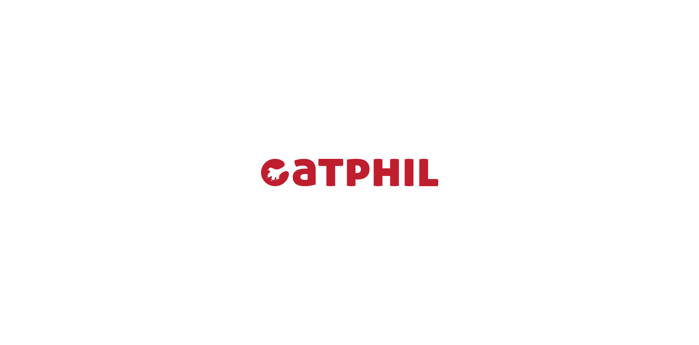
Logo for the manufacturer scrapers for cats.

Icon for Elle & Elle A Health Spa for women.

halo, http://www.youtube.com/watch?v=QwOU3bnuU0k&ob=av3e
Symbol paradigm change! Logo combining the two most powerful ancient symbols there is. Yin & Yang and Flower of Life. In this case it needed to be the basic form of Flower of Life, the Seed of Life, to have the form nicely integrated as one. This logo is for a Feng Shui consultant that asked specifically for the energy of both symbols. The logo is copyrighted. The feminine fuschia color combines the universal loving energy of pink with calming blue, making the logo strong, passionate and confident. Some orange was added to give it an extra energy boost, to add depth and more symbolism.