Highest rated logos
Highest rated logos – Page 68

Nantes means wind,sea,sails. In this logo you should be able to see: sails, ship, face, weather vane and anchor. + custom made typeface. Cheers !


Cute and playful logo great for the children's workshop or even kindergarden. Also it could be used in entertainment and media. However, the possibilities are limitless :)

Living Free - Coffee & Shop http://cargocollective.com/okey

Ambigram

Sportswear.

This logo was designed for my personal use. It is made up of the 2 initials s and g of my name, which are also connected and drawn using one line.

The logo for the online shop accessories for smoking pot. Bletki means rolling papers in Polish.
Designer: Piotr Ploch

a cute colorful and funny rabbit (bilby) for Australia illustration
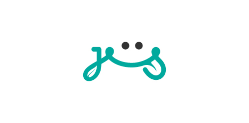
Organic Juice

Startup for a marketing
Eco-friendly/green/organic/!FRESH! logo.
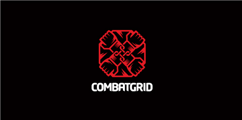
Proposal for Combatgrid an online community where aspiring MMA fighters/promoters/gym trainers/ring girls/etc can gain exposure and encourages social networking, blogging, etc, and has tools in place to make it easier for those in the MMA business to advertise themselves.
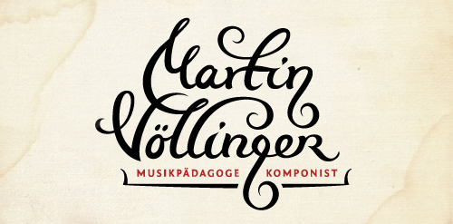
Logo design for composer, music pedagog, organist and conductor. The "g" letter is made to look like violin key. The client wanted happy and joyful look but still to represent proffesional musician.
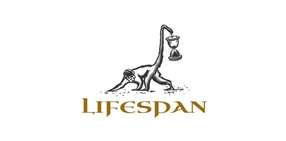
Lifespan by Boldflower Design Studio, Contact me: meksikositi@gmail.com

"Kręgielnia Po AGHu" offer wooden bowling game. The name of company mean more or less "Bowling after AGH". AGH is a polish University of Mining and Metallurgy. The company owner is a graduate of the AGH, hence the name.

logo designed for a discourse & filmclub organised by the ELTE College for Advanced Studies in Social Sciences, Budapest
see more here
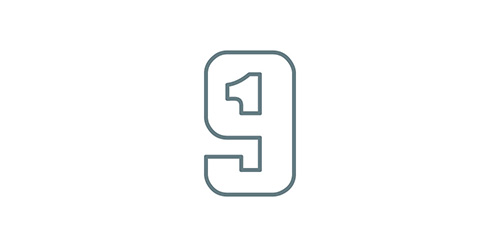
An additional concept for the same project here, http://samadarag.deviantart.com/art/Nineteen-455034919 More on Behance, https://www.behance.net/gallery/17196859/Nineteen-Monogram
Logo design with a traveling bag/trolley made into a drawer to symbolize an organized traveling.

Logo created for the pet care company... Creating a symbol that can work well in text as well as standalone.

Sunrise

Ooce is a media application developed as an all-in-one solution for anyone who uses camera, listens to music, streams online, etc. The team behind Ooce is a forward-moving team with a determination to improve.
Logo para cervejaria artesanal.

flower Shop

Self-branding logo featuring a wolf.