Martin Vollinger
Martin Vollinger
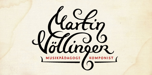


- Logo design for composer, music pedagog, organist and conductor.
The "g" letter is made to look like violin key.
The client wanted happy and joyful look but still to represent proffesional musician.
 Designer: balic
- Submitted: 10/03/2011 • Featured: 11/12/2011
- Stats: This logo design has 11789 views and is 0 times added to someone's favorites. It has 12 votes with an average of 3.92 out of 5.
Designer