Highest rated logos
Highest rated logos – Page 64
Logo made for new software company that designs, programs and publishes iPhone apps


International Organization - fire prevention. www.lukaszjackiewicz.pl

Logo design for social media management company

Logo design for a movie production house based in India! It's approved and currently in use by the client.

Logo design for digital marketing agency...........
MF monogram logo

https://dribbble.com/Dujkovic
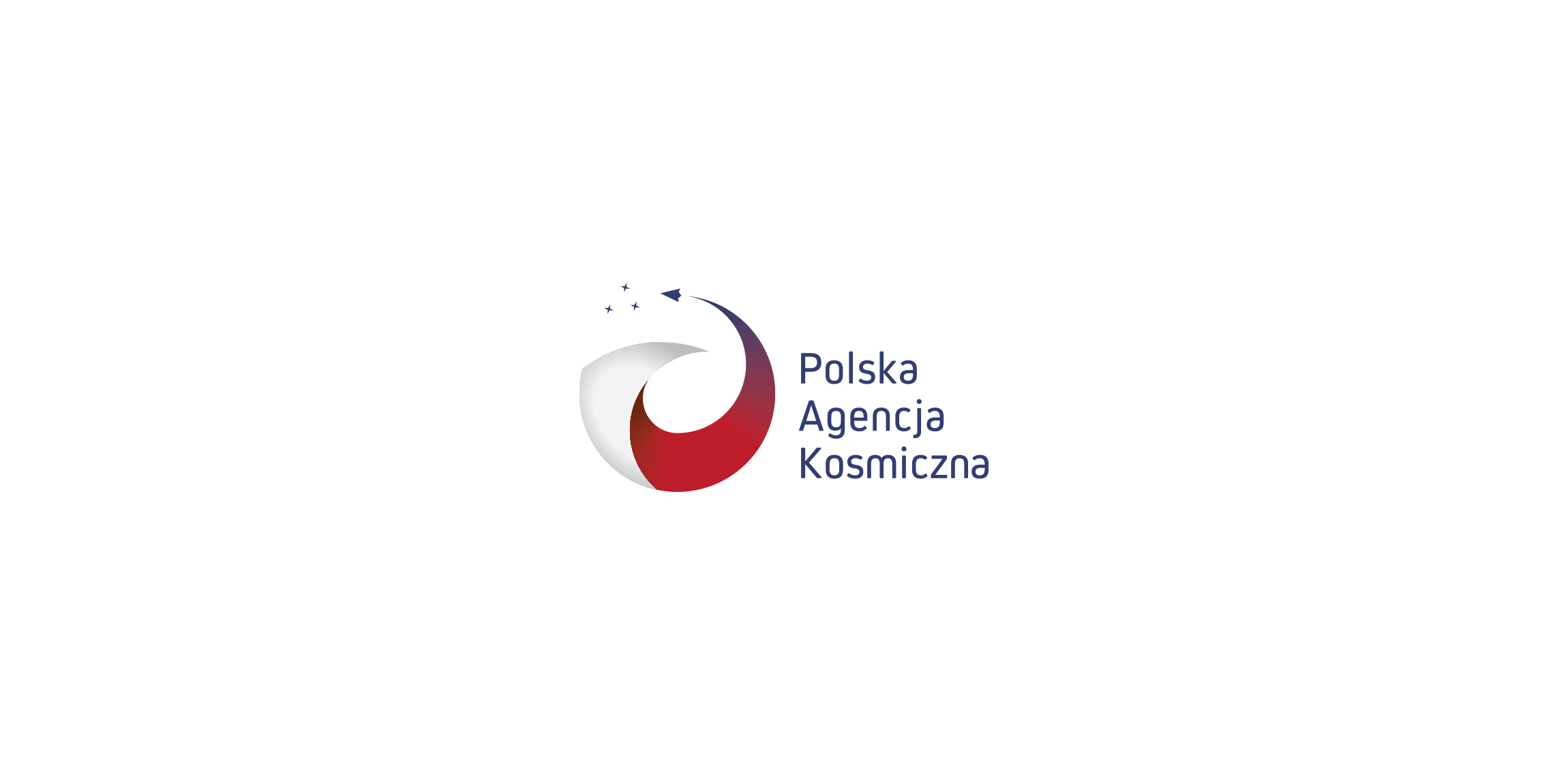
logo for Polish Space agency. Several concept combining Poland (as a country shape), rocket/space shipt and orbit.
Perfect for music. You can buy it if you like.

.

Logo for Pieces Auto Pro (unused proposal)

Visual concept

Custom made logotype design for a Swiss cosmetic line-up. Made from scratch.
Logo made for a leading polish manufacturer and contractor of the transit advertising. Symbol contains the outline of the Polish country and the shape of the car.
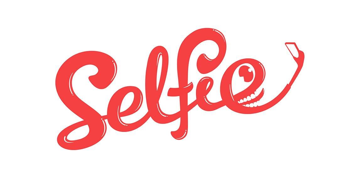
Selfie

Logo for company which provide servers for bloggers. Logotype created in my old style (two meanings in same icon). You can see lab tube which made from newspaper.

For sale!

Ingenious and simple brand. For sale!
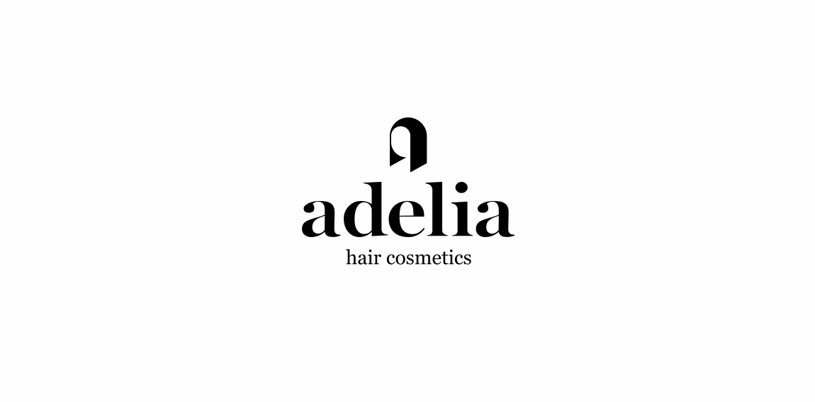
Hair cosmetics More: https://www.behance.net/gallery/27492789/Adelia

Camerton (tuning fork) - the sound standard (Russian word "камертон").
"Wine's Camerton" – the standard of the best wine.
Logo for wine shop (noble wines)..
Logo design for the graphic design studio called 'nekarstudio'.

Vanilla & Pepper is a company organizing all types of events, conferences, events and weddings.

Strawberry Assurance is a consultancy firm specialising in risk assessments, security, installation and disaster recovery of IT systems and networks. The logo mark was constructed using triangular shapes to represent the 3 point process in which Strawberry Assurance operates: risk assessment, undertake required tasks to secure IT systems and provide in-house training to the organisation where applicable. The bold angular shape of the mark combined with a carefully selected logo type and colour palette provides the company a with a powerful and authority presence whilst remaining friendly and approachable.

Company that is specialized on breeding chickens and shipment of chicken meat and eggs with planned expansion to chicken half-stuff production. The design idea is to differ various type of the production by using different colors for the underlying 'egg' on the logo. E.g. pink - for chicken legs, green - for fillet etc.